Is there any use for a “professional” photo screen? To try to answer this question, I suggested the following experiment to a photographer: test the BenQ SW2700PT, a reasonably priced pro photo screen and tell us what he finds.
The question of the choice of the screen often comes back to the amateur photographer who has not necessarily invested in a photo screen, who thinks that it is an important investment and that the difference is not as justified as some people want to say. Here’s more.
This screen at the best price at Miss Digital …
This screen at the best price at Amazon …
Note : This test was carried out by a photographer working for both private and industrial clients, used to calibrate his equipment, in partnership with the BenQ brand which lent the equipment. We chose the BenQ SW2700PT screen for its professional positioning without the price being a deterrent for an amateur photographer (sales price including VAT May 2019: 699 euros).
BenQ SW2700PT screen test: Why use a photo display?
I am like many photographers, as soon as I have a little budget for photographic equipment, my first reflex is to ask myself if I might need a new lens, a new camera body, a flash or studio equipment.
Never, until now, have I wondered whether it would be appropriate to invest in a professional photo screen. Worse, I always had the feeling that these screens are often presented as indispensable, but in the end if it’s only a question of broadcasting one’s images on the Internet and social networks, what’s the point of investing?
So when Jean-Christophe from Nikon Passion offered me to test the BenQ SW2700PT screen, I jumped at the opportunity. This screen, considered as professional compared to the usual office monitors, could it bring me anything? It was a great opportunity to put the professional hardware into perspective with my more standard monitor.
An update on the starting situation
I bought my current display, a Samsung SyncMaster F2380M, ten years ago. At the time, I was wondering about the choice of screen and I chose this model for three reasons:
- it offered an excellent level of contrast,
- a 23″ widescreen for a reasonable size,
- it was well placed in terms of image refresh rate.
This last criterion seemed important to me because at the time I played a lot of video games, so for a budget of 300 euros, it was a good choice.
As far as colour management is concerned, I must admit that I realised very quickly that something was wrong. I bought an x-Rite ColorMunki color sensor to calibrate this screen. As a result, things went back to normal, at least as long as I stayed in the sRGB color space.
Background to this test
You have probably already read the tests of specialized sites that dissect the screens in the smallest details and provide you with detailed graphics on color restitution (Arnaud Frich’s site for example).
I’m not going to do the same here, these graphs require a very precise test protocol, comparisons with other screens, and as exciting as they are, you have to know how to interpret them to make your choice, it’s not obvious for everyone. I will therefore try to give you my feelings during this test and what I found in relation to my personal configuration.
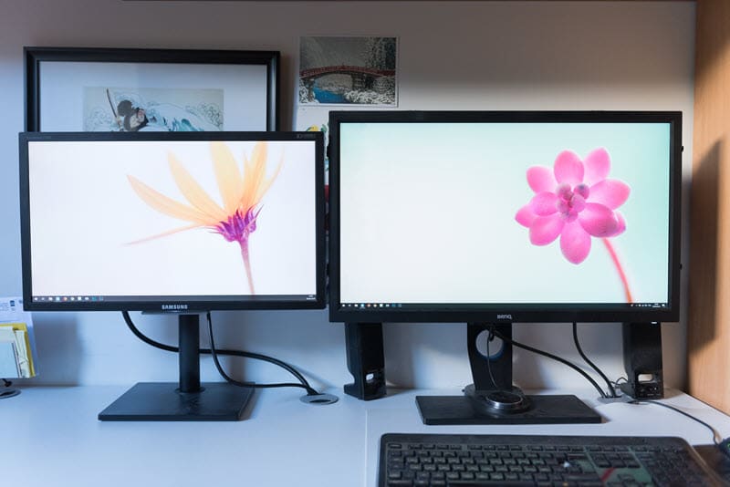
Test of the BenQ SW2700PT screen: on the right the BenQ under test
The BenQ SW2700PT BenQ monitor: presentation
The BenQ SW2700PT offers a 27″ inch IPS panel with a 16:9 ratio (2560 x 1440 – pitch 0.21 – 108 dpi), matte, deep blacks, well thought-out ergonomics and above all a high colour performance with a colour spectrum up to 99% of the famous Adobe RGB (100% sRGB, 100% Rec709).
If you are unfamiliar with the concept of color space, read this article. Simply put, remember that there is a significant difference between what your eye can perceive in terms of colour and what a screen is capable of reproducing.
The sRGB space is used by almost everyone, especially on the Internet.
The Adobe RGB space contains more color shades, especially in green. It allows a more faithful rendering of your photos, which is useful if you make prints (printing or pro lab).
The size of this screen is impressive: it’s huge! With 27″ and a QHD resolution of 2560 x 1440 pixels (4x Full HD), I had the impression to dive into the picture. The feeling is even vertiginous at the beginning, it took me a few days to get used to it.
After this adaptation period, you have to admit that this size is a nice asset: seeing your image in large and accessing Photoshop and Lightroom tools at the same time (and the dual screen mode), it’s comfortable.
Ergonomics
From a functional point of view, the BenQ SW2700PT display features the famous anti-glare cap, multiple DVI and HDMI jacks. It also functions as a USB hub with two 3.0 sockets on the side and even an SD card reader. It’s quite handy!
The screen is very easy to rotate, it can even be rotated 90° to switch to portrait mode, as long as you have enough cable length and space on your desk for such a rotation!
A more anecdotal point in my opinion, the BenQ SW2700PT has a wired remote control placed under the screen that allows you to have up to three quick shortcuts. By default, they are set to change the color space with one click, with Adobe RGB, sRGB and then black and white. These keys are customizable, but I haven’t found any real justification for their use.
Colour rendition
One of the promises of these professional monitors is that not only can they display more colours, but also that the calibration is rigorously done at the factory. When you take the screen out of the box you should be able to use it without touching anything.
The BenQ SW2700PT is no exception. Hardly connected, the colors seemed coherent to me. To be sure, I used a calibration probe to compare the new profile to the default installed profile.
There was almost no difference, except for a very slight magenta dominant, barely perceptible. In comparison, when I calibrate my Samsung SyncMaster F2380M I often get a shock when I see the before/after because the screen always ends up turning blue.
sRGB vs Adobe RGB: a difficult comparison
If you have difficulty, as I do, interpreting the scientific graphs of screen testers, it is difficult to compare an sRGB screen and an Adobe RGB screen, for two reasons.
The difference in displayable colours between the two spaces is not so great, and is mostly concentrated in the greens. Admittedly, the human eye is more sensitive to green than to other colours, and this has an impact on all shades, but it is not so obvious (at least to me).
An Adobe RGB image on an sRGB screen is very saturated.
An sRGB image on an Adobe RGB monitor looks dull. It is therefore difficult to simply compare the renderings of one profile with the other based on our vision alone.
Finally, an sRGB photo on a calibrated sRGB screen looks good, just as an Adobe RGB image on a screen such as the BenQ SW2700PT will look great.
In short, you’ll have a hard time making up your mind about the performance of this or that color space as long as you stay in the digital display. Only the objectivity of the scientist can make the difference, that of the photographer a little less…
A talking test…
I performed this test using identical color gradients placed on the two screens, mine and the BenQ SW2700PT, and then I took a picture of the whole thing. Of course, I used a color chart to make sure the white balance was correct.
Here are the results:
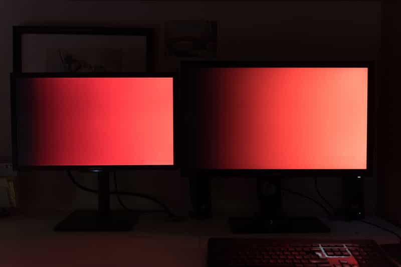
In the red ones, the differences are not very visible. I still notice a higher density of shades in the center of the image for the BenQ SW2700PT (right), as well as on the highlights. I see more details.
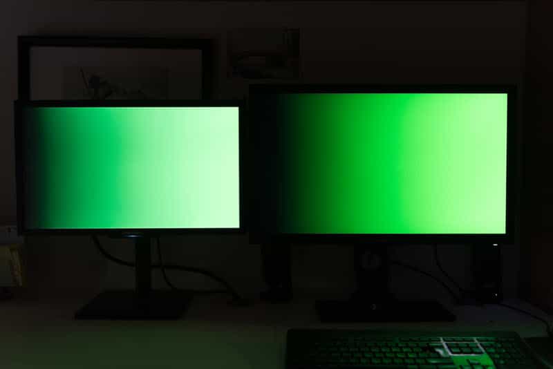
Not surprisingly, it is in the Greens that the difference is most noticeable. Note how the colors are deeper, more vibrant on the BenQ screen. The result is irrefutable.
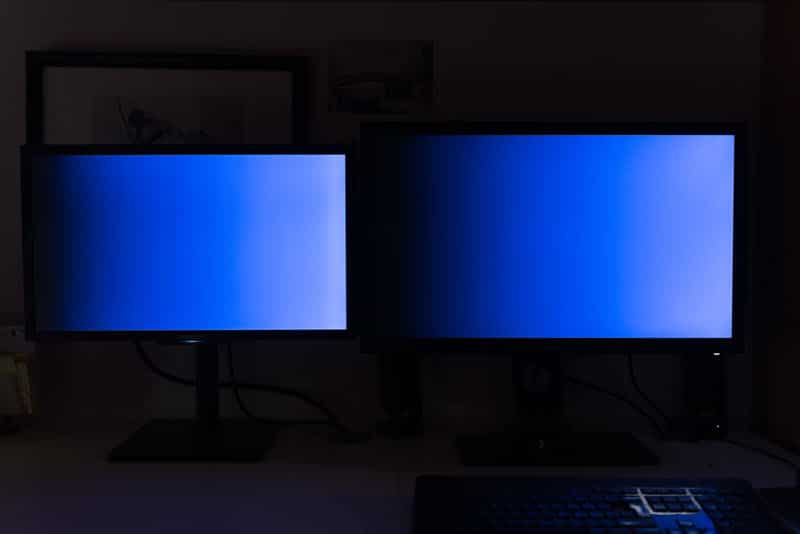
For the blue ones, I see almost no difference, at most a slight magenta dominance on the Samsung screen (left).
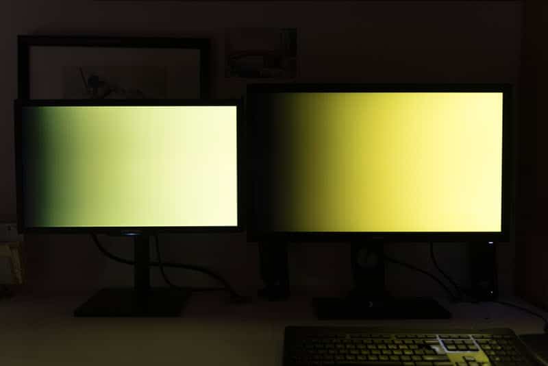
As with green, yellow suffers from a very marked gap between the two screens. On the left, the Samsung screen pulls on the green tones while the BenQ screen on the right is much warmer and more faithful.
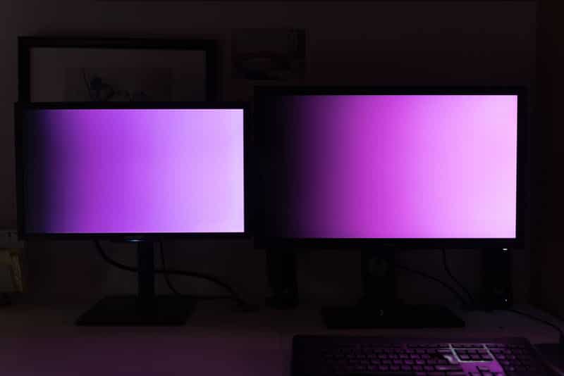
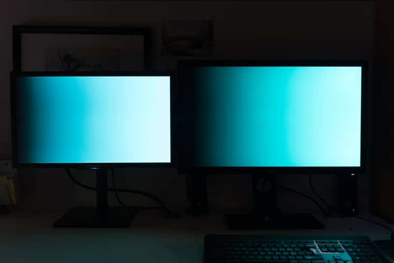
For cyan and magenta, I don’t see any significant difference. The two screens are very similar.
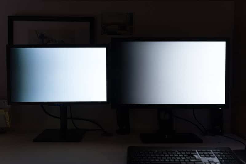
Funny detail, even on a gradient from black to white, there is a difference in color. The Samsung screen tugs towards blue in dark values while the BenQ screen seems more neutral.
Printing: the real test?
A good quality printer has a color space halfway between sRGB and Adobe RGB. This theoretically gives the BenQ SW2700PT screen an advantage over my old Samsung.
Why? Because you should be able to display on the screen the colors of your photo as they will actually be printed. This allows you to adapt the colorimetric rendering so that the print is as faithful as possible (it’s the number one problem for photographers who make prints…).
Note that I used the conditional in the previous paragraph because nothing is that simple. To begin with, in order to optimize your chances of success, you need to create an ICC profile for the printer/paper pair. In my case, I own a Canon MG8150 photo printer and I used Canon Platinum high quality paper.
Still using my ColorMunki Photo probe I calibrated the paper/printer couple. If you don’t have a probe, you might be able to find the ICC profile you need on the Internet, but to be honest, it’s quite difficult.
Then you can use the profile in Lightroom or Photoshop to simulate the printing (SoftProofing or French proofing function). With its larger color space, the BenQ SW2700PT shows a significantly brighter rendering than the Samsung as you can see in the following pictures.
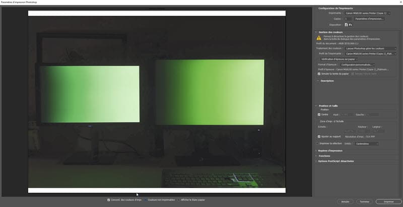
BenQ SW2700PT screen test: screenshot of the BenQ SW2700PT
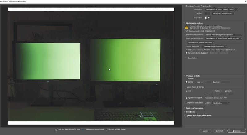
BenQ SW2700PT screen test : screenshot of the Samsung F2380M
This raises another issue: the actual capabilities of your printer. As we have seen above, the printer theoretically has a larger color space than the sRGB space. But if you check the “non-printable colors” box in Photoshop, you can see that this is far from always being the case… at least as far as I’m concerned.
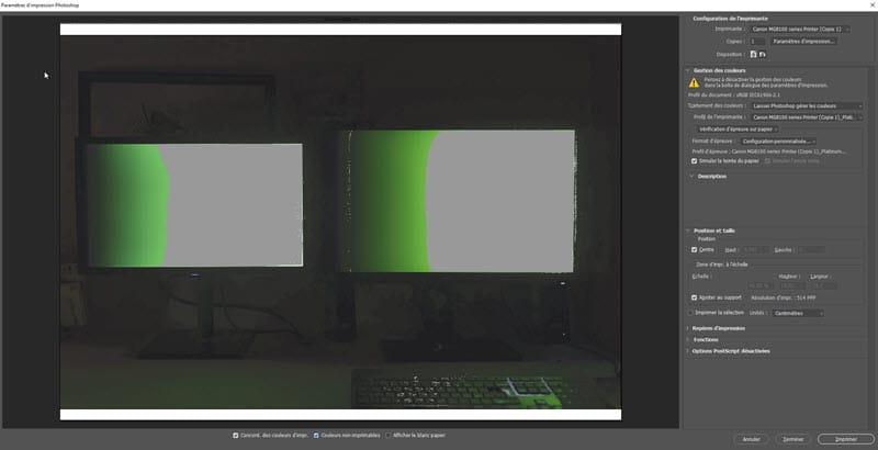
BenQ SW2700PT screen test
On the picture above, you can see in gray all the parts of the image that my printer could not render and which were then automatically replaced by the closest color in the printable spectrum. In this case, it is difficult to obtain a coherent and constant rendering.
However, if you use a professional lab, or if you have a high-performance photo printer, then you will certainly be able to have a much more faithful rendering between the image displayed on the screen and the printed image.
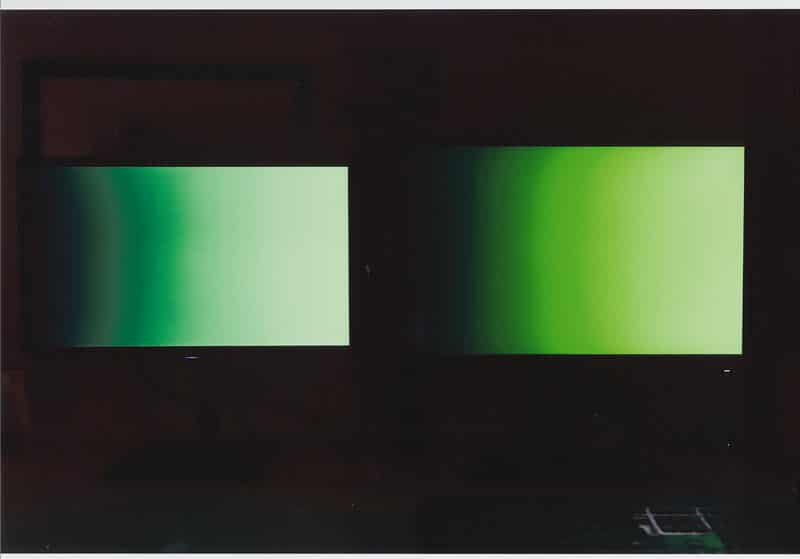
For information, you can see on the photo above the scan of the printed rendering. Although the image has been deeply altered in terms of printable colors, it is still closer to the BenQ preview than Samsung.
BenQ SW2700PT screen test: in conclusion
Before I tested this screen I thought I had mastered the colour of my images. I realize now that I’ve been wrong all these years. The BenQ SW2700PT BenQ monitor does indeed offer a color rendering that my old monitor, even calibrated, cannot achieve.
However, this handicap has never been a problem for me in my work as a photographer, except for the few times I had to make prints or reproduce specific colours for clients.
We live in the age of the sRGB. All the screens are in sRGB, the Internet is in sRGB. Worse, the vast majority of those who see your photos do so on a screen not calibrated (sometimes even a TV screen!). In other words, having control over the colorimetry of your images is wishful thinking.
However, if I had to buy a new screen today, I would take this BenQ SW2700PT without hesitation, because who can do more can do less. It allows you to be confident in the color reproduction of your photos, and if someone thinks otherwise, as long as you’ve calibrated the whole thing, you’ll know that it’s not your screen that’s at fault.
Finally, the last strong argument in favour of this screen is its price. When the pro screens of some competing brands cost 3 to 4 times more, the BenQ SW2700PT is available at the more reasonable price of 699 euros (including VAT) at most retailers such as Miss Digital, Digit Photo, Le Cirque …
You still think it’s too expensive for a screen? The 24″ BenQ SW240 is an alternative that will only cost you 450 euros including VAT, which is close to the price of an office monitor with much higher performance. It’s a great way to make the leap without asking too many questions.
Thanks to BenQ for the loan of the screen and to Nicolas Kalogeropoulos who lent himself to the test game.
This screen at the best price at Miss Digital …
This screen at the best price at Amazon …
Is there any use for a “professional” photo screen? To try to answer this question, I suggested the following experiment to a photographer: test the BenQ SW2700PT, a reasonably priced pro photo screen and tell us what he finds.
The question of the choice of the screen often comes back to the amateur photographer who has not necessarily invested in a photo screen, who thinks that it is an important investment and that the difference is not as justified as some people want to say. Here’s more.
This screen at the best price at Miss Digital …
This screen at the best price at Amazon …
Note : This test was carried out by a photographer working for both private and industrial clients, used to calibrate his equipment, in partnership with the BenQ brand which lent the equipment. We chose the BenQ SW2700PT screen for its professional positioning without the price being a deterrent for an amateur photographer (sales price including VAT May 2019: 699 euros).
BenQ SW2700PT screen test: Why use a photo display?
I am like many photographers, as soon as I have a little budget for photographic equipment, my first reflex is to ask myself if I might need a new lens, a new camera body, a flash or studio equipment.
Never, until now, have I wondered whether it would be appropriate to invest in a professional photo screen. Worse, I always had the feeling that these screens are often presented as indispensable, but in the end if it’s only a question of broadcasting one’s images on the Internet and social networks, what’s the point of investing?
So when Jean-Christophe from Nikon Passion offered me to test the BenQ SW2700PT screen, I jumped at the opportunity. This screen, considered as professional compared to the usual office monitors, could it bring me anything? It was a great opportunity to put the professional hardware into perspective with my more standard monitor.
An update on the starting situation
I bought my current display, a Samsung SyncMaster F2380M, ten years ago. At the time, I was wondering about the choice of screen and I chose this model for three reasons:
- it offered an excellent level of contrast,
- a 23″ widescreen for a reasonable size,
- it was well placed in terms of image refresh rate.
This last criterion seemed important to me because at the time I played a lot of video games, so for a budget of 300 euros, it was a good choice.
As far as colour management is concerned, I must admit that I realised very quickly that something was wrong. I bought an x-Rite ColorMunki color sensor to calibrate this screen. As a result, things went back to normal, at least as long as I stayed in the sRGB color space.
Background to this test
You have probably already read the tests of specialized sites that dissect the screens in the smallest details and provide you with detailed graphics on color restitution (Arnaud Frich’s site for example).
I’m not going to do the same here, these graphs require a very precise test protocol, comparisons with other screens, and as exciting as they are, you have to know how to interpret them to make your choice, it’s not obvious for everyone. I will therefore try to give you my feelings during this test and what I found in relation to my personal configuration.

Test of the BenQ SW2700PT screen: on the right the BenQ under test
The BenQ SW2700PT BenQ monitor: presentation
The BenQ SW2700PT offers a 27″ inch IPS panel with a 16:9 ratio (2560 x 1440 – pitch 0.21 – 108 dpi), matte, deep blacks, well thought-out ergonomics and above all a high colour performance with a colour spectrum up to 99% of the famous Adobe RGB (100% sRGB, 100% Rec709).
If you are unfamiliar with the concept of color space, read this article. Simply put, remember that there is a significant difference between what your eye can perceive in terms of colour and what a screen is capable of reproducing.
The sRGB space is used by almost everyone, especially on the Internet.
The Adobe RGB space contains more color shades, especially in green. It allows a more faithful rendering of your photos, which is useful if you make prints (printing or pro lab).
The size of this screen is impressive: it’s huge! With 27″ and a QHD resolution of 2560 x 1440 pixels (4x Full HD), I had the impression to dive into the picture. The feeling is even vertiginous at the beginning, it took me a few days to get used to it.
After this adaptation period, you have to admit that this size is a nice asset: seeing your image in large and accessing Photoshop and Lightroom tools at the same time (and the dual screen mode), it’s comfortable.
Ergonomics
From a functional point of view, the BenQ SW2700PT display features the famous anti-glare cap, multiple DVI and HDMI jacks. It also functions as a USB hub with two 3.0 sockets on the side and even an SD card reader. It’s quite handy!
The screen is very easy to rotate, it can even be rotated 90° to switch to portrait mode, as long as you have enough cable length and space on your desk for such a rotation!
A more anecdotal point in my opinion, the BenQ SW2700PT has a wired remote control placed under the screen that allows you to have up to three quick shortcuts. By default, they are set to change the color space with one click, with Adobe RGB, sRGB and then black and white. These keys are customizable, but I haven’t found any real justification for their use.
Colour rendition
One of the promises of these professional monitors is that not only can they display more colours, but also that the calibration is rigorously done at the factory. When you take the screen out of the box you should be able to use it without touching anything.
The BenQ SW2700PT is no exception. Hardly connected, the colors seemed coherent to me. To be sure, I used a calibration probe to compare the new profile to the default installed profile.
There was almost no difference, except for a very slight magenta dominant, barely perceptible. In comparison, when I calibrate my Samsung SyncMaster F2380M I often get a shock when I see the before/after because the screen always ends up turning blue.
sRGB vs Adobe RGB: a difficult comparison
If you have difficulty, as I do, interpreting the scientific graphs of screen testers, it is difficult to compare an sRGB screen and an Adobe RGB screen, for two reasons.
The difference in displayable colours between the two spaces is not so great, and is mostly concentrated in the greens. Admittedly, the human eye is more sensitive to green than to other colours, and this has an impact on all shades, but it is not so obvious (at least to me).
An Adobe RGB image on an sRGB screen is very saturated.
An sRGB image on an Adobe RGB monitor looks dull. It is therefore difficult to simply compare the renderings of one profile with the other based on our vision alone.
Finally, an sRGB photo on a calibrated sRGB screen looks good, just as an Adobe RGB image on a screen such as the BenQ SW2700PT will look great.
In short, you’ll have a hard time making up your mind about the performance of this or that color space as long as you stay in the digital display. Only the objectivity of the scientist can make the difference, that of the photographer a little less…
A talking test…
I performed this test using identical color gradients placed on the two screens, mine and the BenQ SW2700PT, and then I took a picture of the whole thing. Of course, I used a color chart to make sure the white balance was correct.
Here are the results:

In the red ones, the differences are not very visible. I still notice a higher density of shades in the center of the image for the BenQ SW2700PT (right), as well as on the highlights. I see more details.

Not surprisingly, it is in the Greens that the difference is most noticeable. Note how the colors are deeper, more vibrant on the BenQ screen. The result is irrefutable.

For the blue ones, I see almost no difference, at most a slight magenta dominance on the Samsung screen (left).

As with green, yellow suffers from a very marked gap between the two screens. On the left, the Samsung screen pulls on the green tones while the BenQ screen on the right is much warmer and more faithful.


For cyan and magenta, I don’t see any significant difference. The two screens are very similar.

Funny detail, even on a gradient from black to white, there is a difference in color. The Samsung screen tugs towards blue in dark values while the BenQ screen seems more neutral.
Printing: the real test?
A good quality printer has a color space halfway between sRGB and Adobe RGB. This theoretically gives the BenQ SW2700PT screen an advantage over my old Samsung.
Why? Because you should be able to display on the screen the colors of your photo as they will actually be printed. This allows you to adapt the colorimetric rendering so that the print is as faithful as possible (it’s the number one problem for photographers who make prints…).
Note that I used the conditional in the previous paragraph because nothing is that simple. To begin with, in order to optimize your chances of success, you need to create an ICC profile for the printer/paper pair. In my case, I own a Canon MG8150 photo printer and I used Canon Platinum high quality paper.
Still using my ColorMunki Photo probe I calibrated the paper/printer couple. If you don’t have a probe, you might be able to find the ICC profile you need on the Internet, but to be honest, it’s quite difficult.
Then you can use the profile in Lightroom or Photoshop to simulate the printing (SoftProofing or French proofing function). With its larger color space, the BenQ SW2700PT shows a significantly brighter rendering than the Samsung as you can see in the following pictures.

BenQ SW2700PT screen test: screenshot of the BenQ SW2700PT

BenQ SW2700PT screen test : screenshot of the Samsung F2380M
This raises another issue: the actual capabilities of your printer. As we have seen above, the printer theoretically has a larger color space than the sRGB space. But if you check the “non-printable colors” box in Photoshop, you can see that this is far from always being the case… at least as far as I’m concerned.

BenQ SW2700PT screen test
On the picture above, you can see in gray all the parts of the image that my printer could not render and which were then automatically replaced by the closest color in the printable spectrum. In this case, it is difficult to obtain a coherent and constant rendering.
However, if you use a professional lab, or if you have a high-performance photo printer, then you will certainly be able to have a much more faithful rendering between the image displayed on the screen and the printed image.

For information, you can see on the photo above the scan of the printed rendering. Although the image has been deeply altered in terms of printable colors, it is still closer to the BenQ preview than Samsung.
BenQ SW2700PT screen test: in conclusion
Before I tested this screen I thought I had mastered the colour of my images. I realize now that I’ve been wrong all these years. The BenQ SW2700PT BenQ monitor does indeed offer a color rendering that my old monitor, even calibrated, cannot achieve.
However, this handicap has never been a problem for me in my work as a photographer, except for the few times I had to make prints or reproduce specific colours for clients.
We live in the age of the sRGB. All the screens are in sRGB, the Internet is in sRGB. Worse, the vast majority of those who see your photos do so on a screen not calibrated (sometimes even a TV screen!). In other words, having control over the colorimetry of your images is wishful thinking.
However, if I had to buy a new screen today, I would take this BenQ SW2700PT without hesitation, because who can do more can do less. It allows you to be confident in the color reproduction of your photos, and if someone thinks otherwise, as long as you’ve calibrated the whole thing, you’ll know that it’s not your screen that’s at fault.
Finally, the last strong argument in favour of this screen is its price. When the pro screens of some competing brands cost 3 to 4 times more, the BenQ SW2700PT is available at the more reasonable price of 699 euros (including VAT) at most retailers such as Miss Digital, Digit Photo, Le Cirque …
You still think it’s too expensive for a screen? The 24″ BenQ SW240 is an alternative that will only cost you 450 euros including VAT, which is close to the price of an office monitor with much higher performance. It’s a great way to make the leap without asking too many questions.
Thanks to BenQ for the loan of the screen and to Nicolas Kalogeropoulos who lent himself to the test game.
This screen at the best price at Miss Digital …
This screen at the best price at Amazon …






Discussion about this post