Let’s discover together the photo(s) selected this month for a built up review where we’ll see that what makes a good photo doesn’t really matter in the end!
(If you don’t know Sunday Photo ReviewI invite you to read the article in which I present the operation).
As you may be looking forward to it, here is the theme for the March photos: black and white.
Yes, just 😉 If you have already posted images this month that do not match the theme, they will not be counted in the quota of 3 images per month obviously. For you help in this theme, I remind you that I already talked about black and white photography on this blog, and I even made a video on black and white conversion 😉.
The best images
Now, frankly, I have to say that you amaze me not bad! There’s really some excellent in what you propose to the critics, and it’s hard to make even a selection among the best (you imagine to select the picture that will be criticized!) So I encourage you to go and admire all this on the Flickr group!
Anyway, among other things:
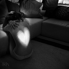
and last but not least, my favorite of the month without a doubt, in a totally subjective way, the soft and poetic image of FolDeNuit:

Comparative Criticism
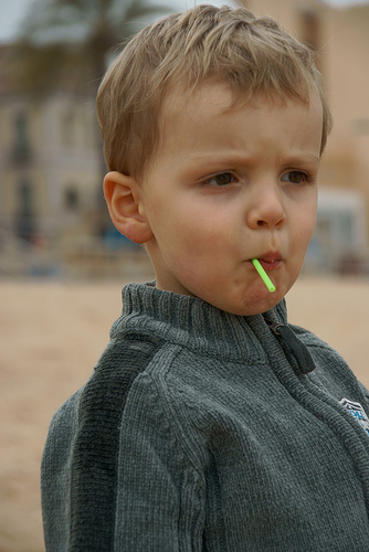
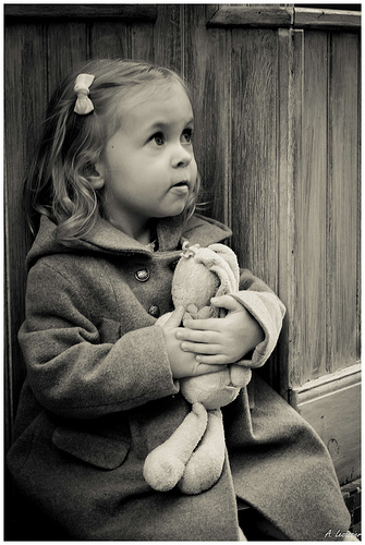
Yes, this month I decided to make a kind of comparative critique of two images, as the opportunity was almost offered to me… on set 🙂 Moreover, I had not yet selected a child portraitAnd yet it’s a common subject: who doesn’t want to photograph our little blonde heads? (especially when we conceived them :D) So here are the two pictures I’m going to compare:


Two portraits of children, then, but the second one we can say is best than the first one. Let’s see what makes their main differencesand you’ll see that it’s not so much:
- L’exhibition the first one is a little underexposedand to enhance a face, it’s best that it be luminous. Here, Olifm could have increased the ISO sensitivity, or increased the brightness a bit by post-processing. Intuitively, one might think that the second one is not brighter, but in fact it is mostly…
- … more contrasting. And the contrast is really critical to give force to an image. Even if in portraits we tend not to contrast the images too much so as not to harden the lines, we can see here that it is still important to add some. It’s especially in post-processing that we can fix this very simply, especially thanks to curves, or other contrast tools.
- The colors: good the 2nd is in black and white (but a good contrasting and deep black and white), but the colors of the first one lack a bit of peps. A little color enhancement in RawTherapee and that’s it!
So these are only 3 technical points enough simple to be mastered thanks to a successful post-processing: and you don’t have to be afraid of software, it’s easy to use and very efficient! 😉
That said.., all wasn’t playing at post-processing, and there are a couple of other differences to note:
- The place left to the gaze In portraiture, it is important that the gaze has “room” in the image. That is to say that there is more space in the image. on the side where the subject looks. This is also valid for pictures of animals (if they have eyes :D).
You can see that in the second shot, the little girl has more “room to look”, which guide better our gaze. - The Story I think that beyond these aspects techniques (which are still important), the second image tells a story. Even without its title (“Vous n’aurez pas mon Doudou !”), we can guess this mini-story, by the situation, the look of the little girl, but also thanks to everything I mentioned before. Indeed, these technical elements contribute to show off the look and the cuddly toy (which is subtly more luminous than the rest of the image).
On rereading, it might sound like “the first one’s bad and the second one’s good.” It’s not not what I mean! You can feel that Olifm a including some principles: for example the depth of field is very well managed, thanks to a rather important aperture (probably the maximum I imagine), a rather long focal length and a relatively distant background.
The main point I want to make is that there is finally not such a wide gap between the two images, and that the differences are mostly on a little more than camera reflection (which is acquired quite a bit through practice), and a post-processing effective but still simple to implement.
That’s it for this month’s review, feel free to add more elements if you see others. And in the meantime, post your photos on the theme of March: Black and White.
And don’t forget to share the article! 🙂


Discussion about this post