Hello everyone, and welcome to this new video on Learn Photography !
Normally, the title must have surprised you a bit, because if you just have the basics in pictures, you must know the notion of overexposure, or underexposure.
A little reminder, though: Exposure is basically the amount of light received by the sensor, or film.. Traditionally, a photo is said to be “overexposed” when it has received too much light, and “underexposed” when it has not received enough.
But I’d like to open your mind a little bit about this today: too much or too little, IN RELATION TO WHAT?
For most of you, you rely on your camera’s exposure meter. Even the diehards who work in Manual mode, you rely on the exposure indicator on your camera (which is exactly the same as using a priority mode, but longer, but I’ve said it before 😉 ).
Your camera’s exposure meter is set to a standard, called “medium grey”.. This feature will make the average brightness of the scene photographed by your camera to be that of a medium gray.
Why? Well, because in most cases, it works pretty good.. If you want to photograph a landscape, a life scene, a portrait, in most cases you will get something right.
But as an aside: I find that digital cameras have a systematic tendency to underexpose…. That is to say, they take pictures that are darker than you’d expect from a normal thing. You see that a lot in pictures of beginners: One of the big problems I keep seeing in my Facebook group or among my beginner students is pictures that are too dark.
I think the cause is simple: in digital, a photo with burnt-out whites is not recoverable.. So the manufacturers preferred to aim for caution, by keeping the information from the highlights, even if it meant having to do a little post-processing. That’s why it’s so important! The concern is that when you don’t do a treatment yet, it makes the photos look a little gray.
But anyway, let’s close this parenthesis 🙂.
My point in this video is that in reality, overexposure and underexposure do not exist. Well, they are, but let’s say they’re only determined by a standard. And in itself, that standard doesn’t make a good picture.
I’ll come back to this right after with a few examples, but first of all, I’ll make a second parenthesis: if you want to have a photo with a “good exposure”, that is to say tones well distributed between dark and light tones, I recommend that you learn how to use the histogram on your device…. It’s really THE best tool to control your exposure, and it’s actually easy to use. I recommend you to watch my episode on the histogram to understand (and laugh a little 😉 ).
But today, I want to encourage you to go further. Indeed, you are not at all obliged to expose as the measure tells you. You can do anything else, as long as it’s what you want to do.
I’ll start by taking some examples of common cases with some of my photos, to get to the more practical side of things, situations in which you could start by testing. And then I’m going to show you some artists who don’t exhibit at all as the cell tells them. 😉
So let’s start with some classical cases where you can expose differently (the best tool for me is exposure correction to do that, on which I also made a video, which I’ll describe).
The first and most obvious case is when you’re backlit. : you have the sun or other light source in your face, and your subject is a little in the shade. Most of the time, if you let the exposure meter do the measurement, you’ll end up with a subject completely in the dark.and a “well” exposed sky. Which is of no interest if you’re trying to get a good look at your subject.
Technically, you can use spot metering on your subject, or exposure compensation (I prefer this option, but it’s up to you).
Here are some pictures where I had to correct the default exposure proposed by the camera to get the result I wanted.
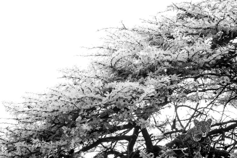
The most recent one was this year in Kenya, where that leopard was invisible in the tree without exposure correction…. In this case, having details in the sky was not important, and I find that white even gives an interesting aesthetic dimension.
It can obviously happen with a window, a portrait for example. In that case.., what’s most important is the face of your subject.
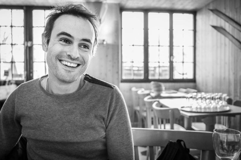
Sometimes you’ll have to compromise to have a face a little in the shadows and not burn the rest too much, like here.
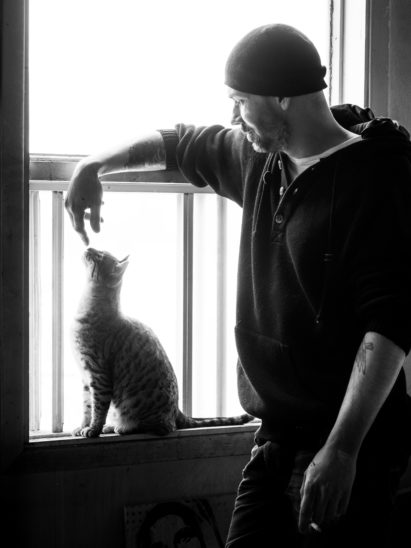
You’ll notice that I only show black and white photosbecause I find that large white areas work better than color.. You have the right to do otherwise, eh, it’s just my preference.
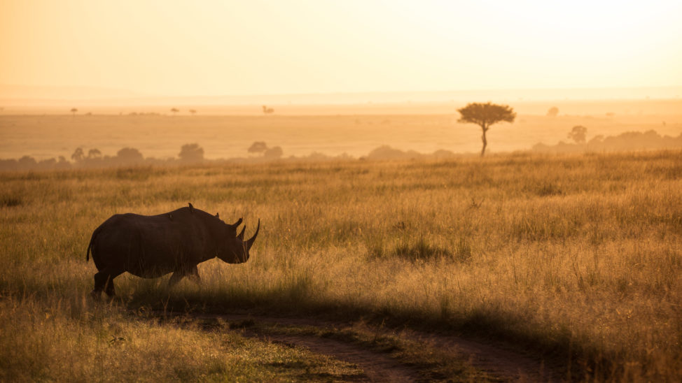
In the same situation, you can also do the opposite, and choose to make a silhouette effect.by choosing to plunge your subject into the shadows (attention : make sure that he is recognizable, that his silhouette stands out.or we won’t know what you photographed).
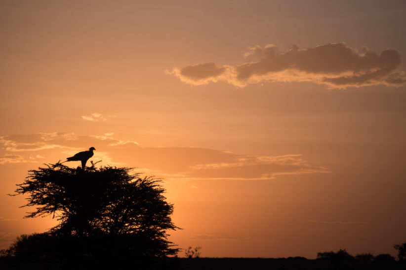
Here too, it can be adjusted by exposure compensation or spot metering on the sky..
Well, let’s say it’s the beginner level case: it’s a situation you’re going to encounter a lot, and it’s easy to manage technically.
Now I wanted to go a little further, and also… to encourage you not to be afraid of “shadow puffs” as they say (i.e. parts of the image all black). It’s not mandatory to have detail everywhere in the image, contrary to what HDR tries to sell you ^^^
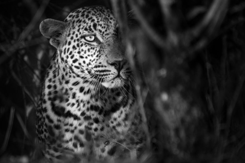
Well, these are still examples of photos taken in Africa, it must be the confinement that makes me want to escape (I shoot this video after almost two weeks of confinement, I hope that when it will be published we’ll see the end of it:) ).
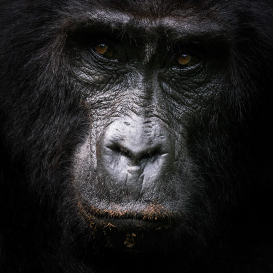
As you can see, these are two scenes with almost black shadows, but they only make the subject stand out more.. And to answer the questions I know I’m going to have: yes, there was a little touch-up, but not huge: the light was already like that, all I did was reinforce something that was already visible in the original shot.
Now let’s talk about a few artists who don’t necessarily exhibit as the cell tells them to.
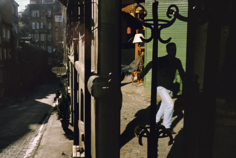
The first one I thought of was Alex Webb…well known for its high-contrast street scenes with bright colours and dense shadows.
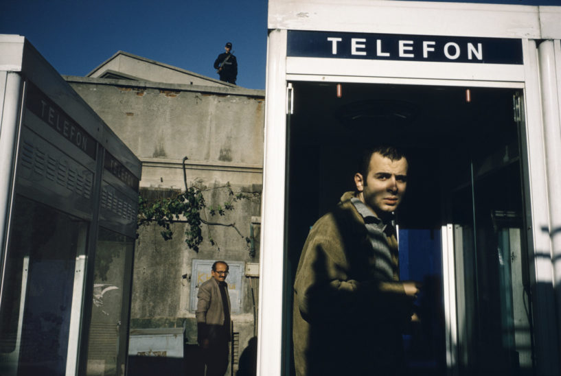
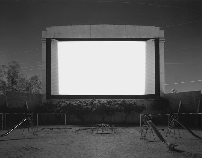
It’s very characteristic of his photographic style. So he shot a lot with Kodachrome, an invertible film that made this high-contrast rendering easier, but it’s still a choice, especially since he doesn’t use it anymore (since Kodachrome doesn’t exist anymore) and he still keeps a similar rendering. So you can sense, obviously, that it’s something he wants to do….
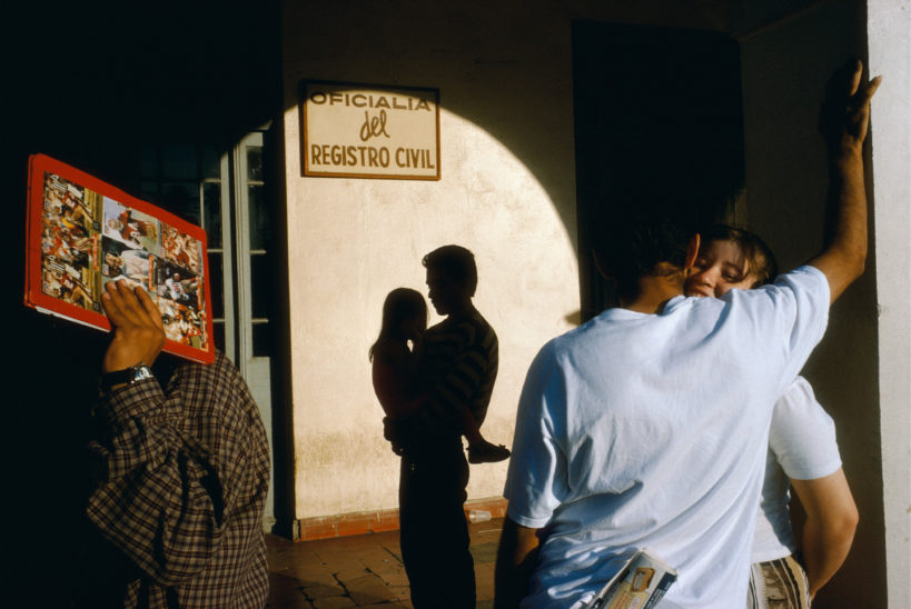
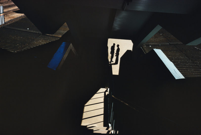
I’m not saying that his cell gave a very different exhibition from what he chose, I don’t know and in fact that’s not what interests me: I just want to show examples of photographers who aren’t afraid of “shadow puffs” or “burnt out whites”..
If you want a book on his work, I suggest you The Suffering of Lightprobably one of my favorite photo books.
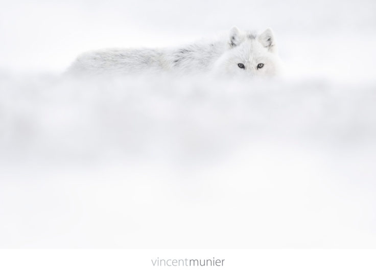
In a completely different style, Vincent MunierMy favourite wildlife photographer, probably my favourite after Nick Brandt (like 3 cm behind) has produced a lot of very minimalist photographs, often mostly white.
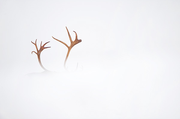
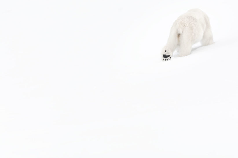
You’ll find that particularly in his book Arcticand also in Solitudeswho I love, but who is unfortunately exhausted by the time I make this video.
We can also talk about two photographers that I recently mentioned on the channel:
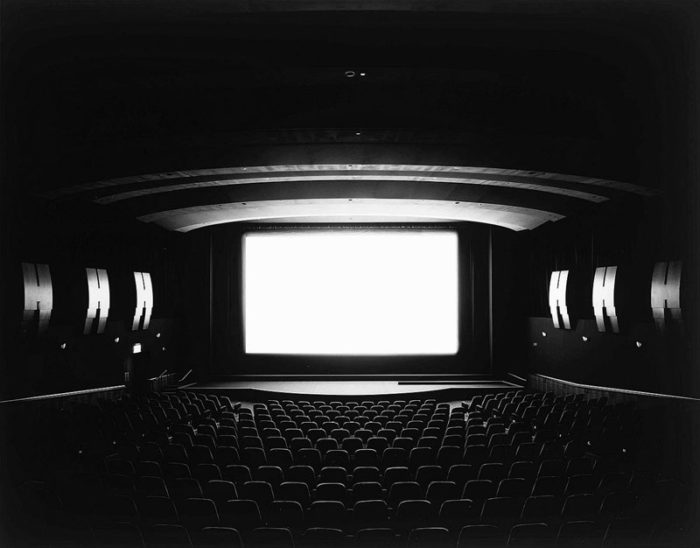
First of all the series Theaters from Hiroshi Sugimotowhich we discussed in the episode of La Photo Aujourd’hui with Louise Brunnodottir.
Sugimoto photographed cinemas during the whole duration of a film. So the screen is obviously completely white (it’s hard to make it more overexposed than that ^^).

Then the highly contrasted black and white of another Japanese, Daido Moriyama…that I mentioned in the Tatsuo Suzuki controversy video.
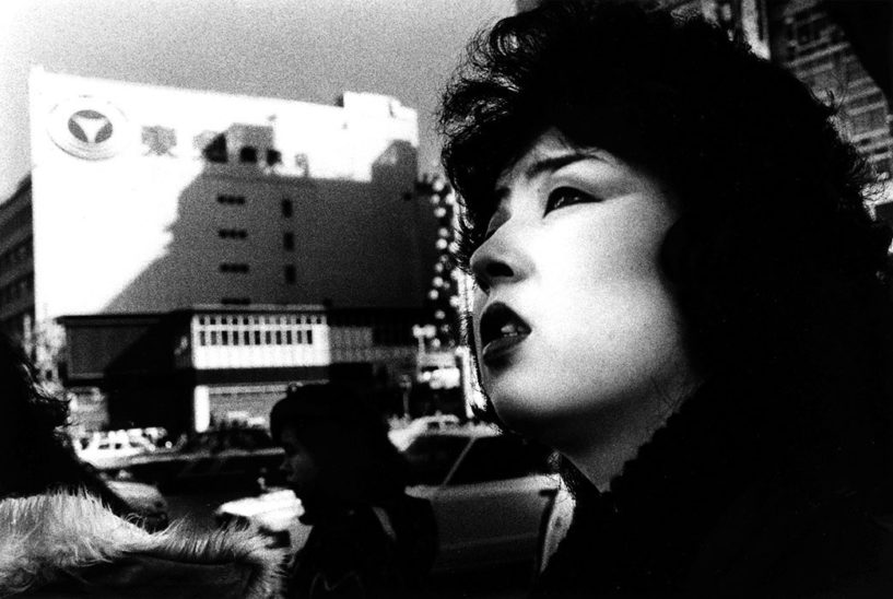
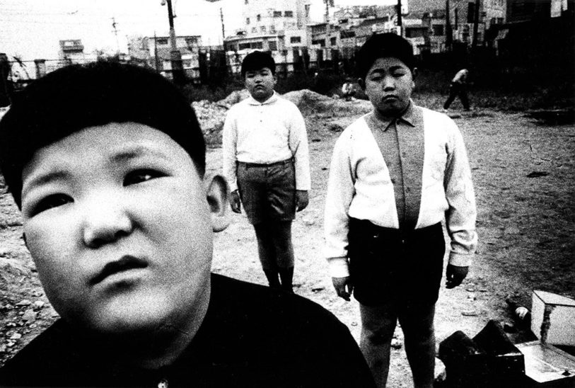
Anyway, anyway, there is no lack of examples of photographers who do not hesitate to create images that are the exact opposite of HDR in the end: they are almost LDR, “Low Dynamic Range”!
Their style is deliberately contrasted, and they are not afraid of deep black or dazzling white invading much of their image.
I wanted to talk to you about that because my goal now is to open your mind, and to get you out of the too technical approach of photography.which is useful for learning how to use your camera, but can limit you to make personal pictures, if you are stuck in a straitjacket to tell you: my photo must be well exposed, sharp, well composed according to the rule of thirds, etc.
So if you had to remember a single message in that video…it’s this one: make a real decision about what to do with the tones of your image. Overexpose or underexpose in relation to what the measurement says, add contrast to the post-processing, in short, you don’t have to stay in a “classic” exposure. It’s not a crime of course, there are a lot of great photographers who didn’t do that, but I encourage you to try, experiment and see what you can get out of it.if only to remind you that it’s a possibility, and maybe someday you’ll use it.
And if you’ve already tried it, comment on it, put us links to pictures where you did it.…that could be of interest to anyone.
That’s it, that’s the end of this video: if you liked it, put an inch up and share it. If you discover the channel with this video, don’t forget to subscribe so you don’t miss the next ones, and to download your free guide. Dare to Composeto improve the composition of your images (and this is guaranteed without third party rules :D).
I’ll see you in the next video, and until then, see you soon, and good pictures!



Discussion about this post