This month, I had chosen to make you work on color, with the “choose a color” theme. So let’s see what this difficult theme did.
(If you don’t know Dimanche Critique Photo, I invite you to read the article in which I present the operation).
In choosing this theme, I expected you to have a little bit of difficulties…but that you’re building pictures for it. Unfortunately, I didn’t see that many pictures that looked like they were taken specifically for this month’s theme, which is understandable since it’s not so easy to find a particular color. But it should have been experiment a little bit more I think it would have only been beneficial 😉
That’s why, for this month of July 2011, I have chosen to make you work on a theme that might be a little easier in this summer period: “The summer is coming and we’re going to have a lot of fun!light and shade». Well, easy is saying a lot… You’re still going to have to be creative to come up with a nice way to bring out the shadows and the light this month. But I’m sure it will train your eye to pay attention to the lightand there’s nothing more important in photography !
Pictures of the month
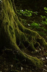
It’s official, ThisIsLouloute is now going to be present every month in this XD Plus Seriously, a photo that perfectly matches the theme, and that manages not to annoy despite the presence of only one color, thanks to an beautiful light that really brings out the mosses. (By the way : photo taken with Canon 1000D and 50mm f/1.8, about 500€ of photo equipment 😉 )

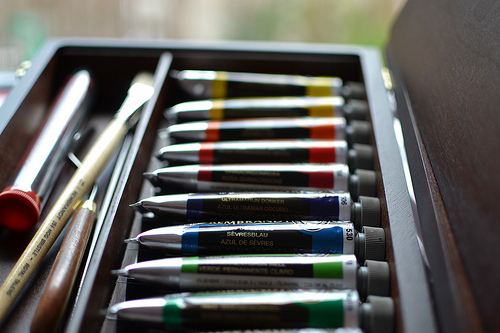
Another photo that matches the theme by twisting it a bit: “choose a color” could also be thehistory of the picture, and I must say that I had thought a little bit about this hijacking when I gave you the subject ;D I’m glad to see that someone thought about it 😉 This picture is really reviving I think! The composition is to the millimeter to precisely frame the box, and the colors are good. livelywhich goes very well with the picture.

And finally two photos that are a little less in the theme but that deserve your attention:
- This landscape of Saint-Malo with an excellent composition that makes wonderful use of a curved line to guide the eye, and a human silhouette to give strength to the photo, scale and tell a story. (We talked about it in the interview with Madame Oreille a few days ago).
- That gull at sunset. At first glance, one can say that it is not correctly exposed, since it is hardly distinguishable, but for the moment I find the exposure perfectly managed to highlight the light. You can see the veins through its leg, the background colors are very pretty, the depth of field is well managed, and the centered subject does not disturb because it is balanced by the sun.
This month’s review
It’s time for the monthly review! Here too, Zeclarr has decided to deflect the subject by interpreting it in this way:

The most :
- Reduced depth of field The use of a 35mm f/1.8 (Nikon, Canon f/2 version) has made it possible to have this very nice reduced depth of field that highlights the subject. If you look at the texture of the wooden box lid on the right, you will notice that it is also well highlighted in the sharpness area, partly because the rest is blurred 😉
- The focus we can see that it is made voluntarily on the “bleu de Sèvres” tube, which is perfectly net. It’s also always interesting to have some text on a picture: indeed, it directly reminds us of human beings (since we’re the only ones writing, well, apart from a few bonobos). But the human or the reminder of the human is an eye-catching element.
- The colors the colors are lively and well-saturated, which always gives pep to an image, especially since it was the theme 😀 However, they could be better highlighted .
The least :
- The exhibition …because the exposure leaves a little to be desired. In my opinion, this is the main weak point of the image. We can break it down into 2 parts:
- A globally underexposed image the image is quite dark in a general way. The fact that there are no details in the shadows is not necessarily very serious, but there even the colours on the tubes are dark. Given the exifs, it would have been quite possible to expose more of the picture, since 1/250th is more than enough at 35mm to freeze the image. We can see in the EXIFs that the aperture priority mode was used: the camera should have detected the underexposure and overexposed on its own. But it didn’t (we’ll see why right after). To correct this, there are 3 possible solutions: use a different brightness metering mode, use exposure compensation to expose the image a bit more, or switch to manual mode (M).
- Overexposed highlights the picture may be dark, but the reflections on the tubes are very clear, and overexposed. It’s for for that reason that the camera’s light measurement was a bit wrong: it detected these highlights, and in order not to burn them out too much, it underexposed the image. I find these burnt areas disturbing here. Obviously, the room must have been relatively dimly lit, but there must have been a window in the background where the strong light was reflected off the tubes. Difficult conditions, therefore, even unmanageable. So what’s the solution?
In this situation, if we can, we should try to check the light. We could either take the light out of the window (hop, the curtain!), even if it means turning on the room light so it’s not too dark. Or if we wanted to keep the reflections, even out the light by putting a flash. I’m not advising it in a general way, but by not settling it… not as much as possible, and by broadcasting it (which you can do on your own at home), it probably would have improved the exposure.
- The composition Overall it’s good, but would have deserved more attention to detail. Mainly framing so that the edges of the box are parallel to the edge of the frame, and not cutting objects. It would have only required to move back a few centimeters, and to slightly straighten the frame. It’s quite normal not to think about everything when you start, but you have to be violent to check that before shooting (even if you have to check afterwards and redo the picture if needed). Remember to (re)read the 10 questions to ask yourself before taking a picture.
Here’s what I can say about this picture: and youtell us what you think about comment ! 🙂
Here’s to your photos for the July theme: “light and shade” !
And don’t forget to share the article! 🙂


Discussion about this post