![📷 Definitive guide to create photographer logos [2021]](https://big-photography.com/wp-content/uploads/2021/02/logos-de-fotografos.jpg)
home
>
Blog
>
Photography
>
Learn how to create your photography logo and have everyone recognize your talent
Learn how to create your logo …
Good! Sometimes we tend to forget that behind a good photo there is an artist. An author. For that reason it is important that those who are behind the camera and dedicate themselves to this professionally think about how your customers can quickly identify them. This is when photographer logos become important.
So if you are starting in this incredible world, you should think of yourself as if you were your own brand, so I will teach you the best tips to create extraordinary photographer logos that can be identified by your clients always. Speaking of logos, do you know the incredible history of the logo? We will tell you! Now yes, let’s get down to it!
Index:
- What are photographer logos?
- Why are photographer logos important?
- Characteristics of professional photographers logos
- How to create professional photographers logos?
Let’s start with the first. What is a logo? Well. The logo is a graphic symbol that is made up solely of text, unlike the isotype, for example, which is made up of an image. Anyway, to complement the idea we recommend these differences between logo, isotype and other terms.
That said, photographer logos are symbols that seek to communicate an idea in a few strokes; that is, in a simple way. Surely you must have seen that the best logos for photographers are made up of their own names or surnames.

Image: Behance / Olendra Studio
This is because, first, it’s a simple way to remind yourself and, second, because the logos of photographers they have to function on small or large scales. This last factor can be achieved if the strokes of the photographer’s logos stand out for their simplicity.

Many believe that implementing a photographer’s logo has the function of preventing someone from copying your photo. If you have an exclusive, for that you could create a watermark for photos, which will be based on your logo.
The point is, no, professional photographer logos are not intended to prevent copies. At least not as a main purpose. The main importance of professional photographers’ logos is that, as photography has become a highly demanded profession, they will be able to differentiate themselves from their competition and it will make the work easily remembered by clients. In fact, it is very important that you know how to analyze your competition.
Ramiro Rodríguez, professor of our online course Start your first photography business, explains more clearly the importance of photographers’ logos.
“When defining your image as a professional and as a company, you will find it necessary to have a logo that identifies you. It is important that the client quickly identifies the person behind the camera. That will generate trust, which is key at work.
Professor Ramiro also tells us that there are many logos of photographers who, when trying to be friendly with consumers, appeal to complex images that end up being difficult to identify. Thus, the main element of the best photographer logos is simplicity.
This leads us to wonder what characteristics photographer logos should have. Here we give you the answer.
Sell your photos online like hot cakes! Learn how with this free guide

The best logos of photographers, as we discussed above, They are characterized mainly by being simple, but at the same time incredible. For this, defining the identity of your brand is essential for your logo to comply with that and other characteristics that we show you below.
Unique and unmatched
Professional photographer logos are always unique and they have the personal stamp of each artist. Therefore, it is essential to define the identity of the photographer in order to give that different touch to the logo.

Image: Pinterest
For example, if you dedicate yourself to wedding photography, you could accompany the text with a subtle graphic resource that identifies you as such. In this way, it will be easier for your clients to identify and recognize your work.
Simplicity above all
I am aware of my insistence on simplicity in photographer logos, but it really is paramount so that the identity of your brand can penetrate the hearts of your customers.
Surely you have ever heard that “less is more” and this phrase, as cliché as it sounds, applies here perfectly. Logo design for photographers should stand out for its simplicity and forcefulness. .

Image: Gaetano De Marco
Customizable photographer logos
Lines above we commented that one way to avoid copies of your work is create a water signature for photos. Well, to create it, the logos of photographers must be adaptable and not only for that case, but also to place it in different sizes and change the colors when necessary.
Let’s say your logo has a dark color, but your photo also has a similar background. So, to make it look, you have to keep in mind that at some point you will have to change the color of your logo.
Did you know that you can build your own photo studio? Learn how with this free guide
The importance of functionality
The previous point has to do directly with how functional the logos of photographers should be. The typography, elements and colors of the photographer’s logos are chosen always with all situations in mind. They must be seen and stand out in any circumstance, not only in photographs, as this logo will be on your website, your presentations or social networks.
The best professional photographer logos look good and always stand out where they are placed.
Very well! If you’re wondering how to make a signature for photos, it’s time to get down to business and start designing logos for photographers.
In addition to relying on the characteristics of professional photographer logos, we offer you a series of tips that you should take into account to create your own.
Yes. Although there are some portals where you will find free photographer logos that will serve as a template, never use them! Our recommendation is that create a logo that fully identifies you, able to see the person behind the camera in that logo.
Now, follow these tips to get started with logo design for photographers.
Include your personal name
You have to start to stand out as a brand, so you must include your personal name in the logo. Or first and last name. Or, if you have a partner, play with both surnames. The point is that photographer logos have to move away from formality a bit and go for reliability.
For example, if you think your name sounds very serious, you could modify it slightly. A kind of stage name. Imagine your name is Rosario Hernández: How does ‘Charo Hernández’ sound to you for your logo? Better, right? These naming tips will help you complete this step.
The idea is that when creating photographer logos you can play with your personal name or with the last names of your partners. Do you remember our teacher Ramiro Rodríguez? Well, he runs a photographic studio with his partner Florencia Melero. What is the study called? Melero Rodríguez.
Use of fonts
Once you have the perfect name for your brand, for the design of photographer logos it is important that you choose a legible and powerful font. Do not worry! We share the best fonts for logos.
Although you can choose an exact font for photographer logos, you have all the freedom to modify it according to your creativity and what you want to obtain as a result.
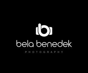
Image: Bela Benedek
To achieve this, we recommend designing your logo in Adobe Illustrator. If you do not master this program, we will teach you how to design logos from scratch.
Anyway, you can also explain the idea you have to a designer. They are specialists doing magic in creating logos for photographers and you will see that you will get incredible results.
Pick some symbolic elements
For the design of logos of photographers can be used, in a subtle way, some elements that may differentiate you from other brands and also quickly identify the industry to which you belong.
These elements are generally camera, lens, and shutter. However, you must make sure that their inclusion does not look invasive and, if possible, that it plays in some way with the letters of the photographers’ logos.
If we continue to use the example of ‘Charo Hernández’, we could choose a camera as a resource. How to make it non-invasive? What we did in our simple design was to find the way in which this is part of the typography.
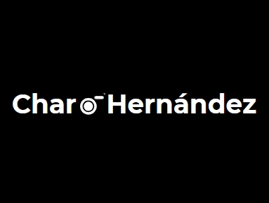
If you look closely, the play of colors, as well as the position of the ‘r’ and ‘H’ make up the camera. Clearly, you can design your logo much better and think of other alternatives, but this simple example It can help you when designing logos for photographers.

What will your corporate colors be?
Do you remember that we told you about your identity as a photographer? To design a signature for photos you have to take into account the chosen colors according to your brand identity.
Although black and white combinations predominate, photographer logos should have corporate colors because they will appear on your digital platforms or business cards.
For example, the same color scheme will not apply for advertising photography as for wedding photographer logos.
How to place your logo on a photo?
Photographers logos must be proportional so that they do not take away the prominence of the image and so that it is not lost within it. So where should photographer logos be placed? Follow these tips.
📌 Never put it in the middle of the whole photo, unless it is a watermark without it becoming invasive.
📌 You can place the photographer logos in the two lower corners.
📌 Leave at least 1% space between the edges.

Image: Behance / Olendra Studio
📌 Try not to occupy more than 15% of the horizontal size and 10% of the vertical margin of the image.
📌 Try to identify the situations in which it will be necessary to place the logo on your photograph.
We’re! By following these tips to create photographer logos, you can design yours and stand out from your competition. We know it is a challenge, but we trust your creativity 😎. Are you ready?

![📷 What is photographic overexposure and underexposure? [2021]](https://big-photography.com/wp-content/uploads/2021/02/sobreexposicion-fotografia-75x75.jpg)

Discussion about this post