Last month, I offered to work on the movement. So let’s see the traditional best photos of the month, and the one selected for the review.
(If you don’t know Dimanche Critique Photo, I invite you to read the article in which I present the operation).
This month, you’ve really made the subject your own. Whether it’s freezing fast motion with a high shutter speed, using slow shutter speeds to highlight the movement of your subjects, or even making one or two yarns 😉 In short, a lot of good surprises. In particular, there have been some interesting attempts to make “ghosts”, those blurry, indistinct silhouettes you get when using slow shutter speeds on people walking. In particular, I invite you to look at the EXIFs of Walking ghosts and Ghosts in movement in which the effect is well realized. You will see that the speeds used are different (1/4s and 1s) and give a slightly different effect.
For the impatient, the theme for October will be water. I hope that for you it is as much the Indian summer as for me, but then we arrive in October and it might start raining (including in the South 😉 ), which could give you good opportunities. (Don’t forget to protect your camera from the rain 😉 ). And then if it doesn’t rain, you have water at home I imagine, so it’s up to you to use your imagination! 🙂
Pictures of the month
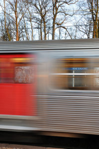
Let’s start with an image that uses the movement of a RER. So far, it’s quite classic, but Julien Mousset has cleverly used the transparency of the train’s windows and its blur to highlight an unexpected element: the name of the station. The effect is very well seen, perfectly realized, and probably required a few tries. In fact, the motion blur (and no yarn as said in the comments 😉 ) is a bit used as a depth of field blur, i.e. to highlight the sharp part of the image.

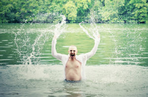
Then an image that, on the contrary, freezes the movement, and is very well done: shutter release exactly at the right moment, well chosen shutter speed (1/500th), very good post-processing with almost pastel colors and almost overexposed whites but very well highlighted on the darker background, and a perfectly centered composition that highlights the symmetry of the gesture and really focuses on the shape of the water projections. A proof that going against the classical rules can be efficient: the histogram must show a peak on the right, and the rule of thirds is far away, but it works 😉

I’m also going to highlight an excellent black and white (you’ll see some of what for in the review right after). Here it’s the movement of a subway that is used, but what I want to highlight is the excellence of the black and white: contrasted as it should be, deep blacks, in short I love 🙂 To see the picture, you have to click here, because Jean-Christophe has disabled the upload of his pictures on Flickr.
The Criticism
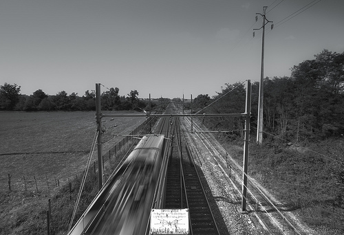
This month, I’ve chosen a picture by Dominique Garcin-Geoffroy, who worked on a TGV Bordeaux-Paris (for the moment, in terms of movement, there’s plenty to do 😉 ).

The most :
- A careful composition The railroad track is perfectly centered in the image, which accentuates the effect of perspective naturally created by the railways. But the image remains dynamic because the horizon is placed at a third of the image. Beyond that, Dominique admits to having cropped precisely flush with the “Danger of Death” sign, which I think is an excellent idea and gives a lot of strength to the image (you shouldn’t be ashamed to crop slightly afterwards). The panel really “comes out” of the edge of the frame like a devil out of its box, and the contrast between the light/dark background and the contrast between the sharpness of the panel and the blur of the train help a lot with this effect. Moreover it constitutes a second readingbecause it remains quite small in the picture and is noticed in a second step.
- Motion blur : The shutter speed used is sufficient to blur the subject (at the shutter speed) while keeping the rest of the image sharp. Personally, I would have tried a slightly slower speed so as to let the train move a little more forward on the track, while accentuating the blur a little bit.
- Well-managed exposure I point this out because the weather seemed to be very sunny (at the same time it’s Aquitaine 😉 ), and that it’s not always easy to take pictures at the right exposure in this weather. The “Danger of Death” sign is slightly overexposed, but it was difficult to do better without the RAW I think.
The least :
- Black and white : It’s not so bad, but you should have pushed the cursor of the contrast in post-processing (and/or playing on levels or curves), which is the first thing to do in black and white. Even if it’s necessarily JPEG and not RAW given the model of the camera, making a nice black and white is one of the things that can be done easily even with a JPEG. I had made a video on the subject 😉 It would have really strengthened the subject, and would have given some density to the sky.
There, do you see any other positive or negative criticisms that I would have missed on this picture? Leave a comment!
See you next month for the Sunday Photo Review on the theme of water. To your umbrellas! ;P
And don’t forget to share the article! 🙂


Discussion about this post