Second Sunday Photo Review, and first of the year 2011! 🙂
This time I have chosen only one image, but before moving on to its criticism, one or two things:
- I could’ve gone with Celine’s “Urban Natural Art” photo “boulaxx”. Indeed the idea is excellentand we feel that there’s been a real effort on the composition. Unfortunately, the only thing that spoils the picture a bit is the others tags on the wall: these are disruptive elements. But that, unfortunately, you couldn’t help yourself. I didn’t choose it because I wouldn’t have had enough to say, but I wanted to point it out anyway 😉.

- I would also like to draw attention to the images of Zakia Hadjadj, especially (but not only) those posted on the band. They are really excellent pictures, and I didn’t choose one for two reasons: the EXIFs data were not displayed (as I specified in the rules of the game), and moreover I wouldn’t have had much to say as they are so technically and artistically successful ! The stitching is really good, the composition is at the top, the photographic choices are francs and make extremely well, in short take some seed 😉 (I just regret the frames and copyright mentions added on the pictures.)

Obstinacy
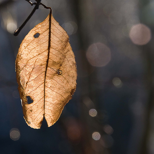
This is the title of the picture I chose, directed by Philippe Feyaerts :

The plusses:
- The choice of the square format We probably don’t think about it often enough, but the square format can be very interesting to compose your images. The classical rules of composition (rule of thirds for example) are less strict, and the format being by definition symmetrical, one can easily center the subject without it being as shocking as in a “classic” format such as 3/2 or 4/3. This is not Philippe’s bias here, who rather chose to stay within the classical rules of composition. It is a choice that is completely defensible, but be aware that we can get out of these rules by taking a little less risk thanks to the square format.
- Simplicity the background is very simple. You can tell that it may have been a bit loaded at the beginning, but it’s cleverly lost in the bokeh so as toremove possible disruptive elements. This gives more strength to the picture, since the subject and him alone is highlighted. Light spots in the background also embellish this bokeh.
Technical Note we can see that Philip closed until f/14, and yet the background is still good. fuzzy. Probably for at least two reasons: Philippe used a long focal length (200 mm), which reduced the depth of field. In addition, the background had to be sufficiently remote to be away from the sharpness plane and thus be very blurry. Feel free to reread the course on depth of field and bokeh if you need a bokeh shot 😉 - Working with light that’s a big part of the image’s appeal. The sheet is illuminated from behindwhich reveals all its veins by transparency. These pretty details do a proud service to the image, and I imagine it was Philippe’s wish to bring out that lovely light.
- Choice of title Personally, I like it when the images have a right titlebecause it helps us get into the picture and let ourselves be carried away by thehistory she says. I like the idea of this stubborn leaf that refuses to fall over! 😉
The least:
- Lack of sharpness : When you look at it at 100%, the sheet is not clear everywhere. On closer inspection, I think there are two factors:
- the depth of field is slightly insufficient The top right part of the sheet, which looks recessed, is blurred. I think we should have increased this depth of field a little. Not by closing the diaphragm more, but probably by moving away or by zooming out a bit. But that might have prevented the full-frame sheet. In that case, why not take the problem the other way around and try to put all the parts of the sheet in the frame. in the same veinby moving around a bit for example? 😉 I don’t know if it was possible in this situation, but I’m putting the idea forward.
- there is a slight motion blur It can be seen rather at the bottom of the leaf. It may be a blur in the movement of the subject (a small draught that would have moved the bottom of the sheet). In any case, this could probably have been prevented by increasing a little bit the shutter speed. You were 1/125th at a focal length of 200mm. It works with a stabilized lens, but it doesn’t allow for sharpness… optimal. It’s better to stick to the rule: “at 200mm, I shoot at 1/200th and not below”. Especially since you were in speed priority mode 😉
- A little lack of post-processing at post-processing, I would have worked on a few small areas that seem slightly overexposed. Nothing dramatic, I’m nitpicking, but small light spots like the ones you can see at the bottom left of the leaf are a little disturbing to the eyes. In your defense, I haven’t (yet) done a tutorial on the subject 😉.
In addition, I would have raised the relief of these ribs by increasing the local contrast (or its equivalent depending on the development software you use). This tool allows you to highlight slight local contrasts (such as those between the dark veins and the rest of the rather light leaf), without changing the overall contrast.
Oh, and you tried it in black and white ? 😀 (yes, now I’m purely subjective :P) - The little branch above Come on, I’m a bit of a pain in the ass right now, but that’s okay. The little branch sticking out from above bothers me a little bit: I would have made sure that the get out of the frame. But nothing serious, the rest of the picture being rather uncluttered 🙂
Here you go, I hope this review will have been useful to Philippe but also to the others who haven’t (yet) had the chance to choose them for this section 😀 Try your luck again this month by adding your image to the Flickr group! (and read the rules 😉 )
Post a comment if you have noticed other defects/qualities, if you disagree with me!
And don’t forget to share the article! 🙂


Discussion about this post