If you do a little (or a lot) of post-treatment as I recommend, you are bound to be attached to the contrasts and colours of your images: you have worked on top for having exactly the result you wanted, thus going to the end of the photographic process. But it can happen that your cherished colors do not display well after exporton other screens or in print. Let’s see how to deal with this problem.
I am obviously not writing this article by chance, since I receive a lot of emails from readers a little bit clueless to see their photos badly displayed. Most of the time, you realize this when you’re print your images for the first time.
The bad news is this problem is very common. The good news is…it’s not that hard to solve.
Colour management

This type of problem has a very common cause: poor colour management, and most often no color management at all. Simply put, the goal of color management is that your photographic intention is to made as good as possible on a maximum number of media (screens of the Internet users visiting your gallery, printing, etc.).
Then why doesn’t it do itself? I’m not going to go into the whole theory on this: it’s long, complex, and not necessarily useful to know in detail.
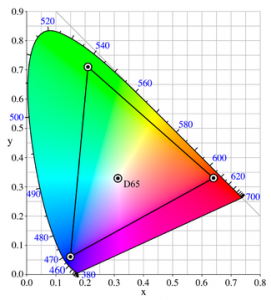
To put it very simply, peripherals (monitors, printers, etc.) do not have not all have the same color rendering abilities. And on top of that, they don’t always give them back as requested. In fact, they won’t give them back never exactly the right colours, if you don’t do anything to help them, that is, if you don’t manage the colours. We’re getting back to that.
If you would like to know more, there are many resources, including :
- the excellent color management guide by Arnaud Frich, very complete, relevant, rigorous
- The no less excellent file on the subject by Patrick Moll, which is spread over 3 issues of Competence Photostarting with numbers 27 and 28. As usual, rigorous, detailed, and of exemplary pedagogy for such a complex subject. To be reserved for those who are really interested in the details 😉 (unfortunately a bit old, but if you’re motivated you might be able to find it!).
In theory, there are many things to do, but today I will deal with the most important one, which will solve the great majority of your problems, the 20% action that gives 80% of the results: the screen calibration (also known as calibration).
Indeed, for the colors to be well rendered elsewhere, the first step is already that they are welcome homeThis means that your RAW development is done on a screen that renders colors well. It will only be never the default case. For that, we’re gonna have to calibrate your screen. Let’s see how and with what.
Calibrating your screen in practice
Might as well announce the color right away, the one and only credible solution to calibrate your display is to use a calibration probe. There are sites that will offer you to calibrate by eye, but it’s too random, and you could even get worse the result. Sometimes there is also a generic profile available with the screen, or downloadable from the internet. It’s better than nothing, but it’s still a bit too imprecise, and I can only advise you to use a probe.

Then some people will say (I know, I did it too when I started) that it’s not useful to calibrate their screen because anyway it’s too bad. It’s completely fake. To tell you the truth, I had even calibrated an old rotten cathodic screen (yes, it’s old !), and the result was anyway impressive.
Even with an entry-level LCD screen, you will already have a more than fair resultespecially for amateur use. Even if they’re not usually the best screens in terms of colour, it’s still worth it.
Which calibration probe to choose?
If you’ve already done one or two searches on the subject, you must have stumbled upon the probes… Spyder from Datacolor, which are the most famous. The biggest advantage for you is that there’s 3 different modelsand that’s three awards:
- The Spyder X Pro (about 140€), which allows to measure the surrounding lightA more extensive choice of target values, and a calibration check function (which saves you from recalibrating if you don’t need to).
- The Spyder X Elite (about 200€), which in addition to the functions of the Pro, allows to set the white spot and the minus point of the screen.
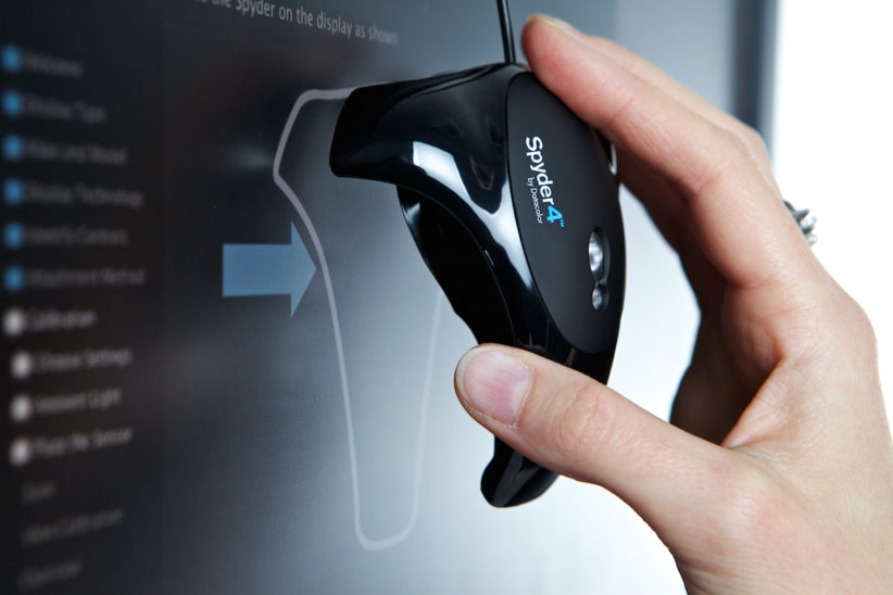
Datacolor was kind enough to lend me a… Spyder 4 Elite The example is therefore carried out with this probe, but the calibration process is very simple anyway and is very similar between the probes. I still use this probe today.
That said.., it is better to calibrate, even with an entry-level proberather than doing nothing at all. If your budget is really tight, you can turn to second-hand Spyder 3 or 4, which are still very decent. You can find somesecond hand on Le Bon CoinIf you’re on eBay, eBay or anywhere else, but be careful not to pay more than 50€, don’t mess around, otherwise you might as well get a new catheter.
How do you calibrate your screen?

The first step is toinstall the supplied software with the probe. If you do not have a CD drive (which is becoming more and more common with the gradual disappearance of this medium), you can download it from the Datacolor website.
Then you’re gonna probe connection to your computer, start the softwareand follow the instructions. I could almost stop there 😛
Try to calibrate in the standard working conditions on your pictures. For example, if you often work with artificial light in the evening, calibrate at that time.
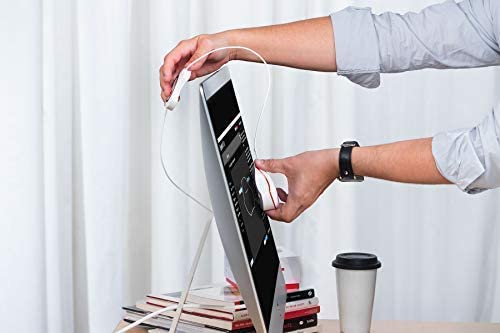
To ensure that the probe sticks well to the screen during the process, it is often necessary to tilt the screen back a bit. Most screens now allow you to do this, but if they don’t, just wedge something underneath to tilt it. Also remember to move the small counterweight present on the cable (it slides on it and will allow you to balance the probe more easily).
Then you almost only have to click on next. If the software asks you to choose target values (which is the case in the Pro and Elite versions), choose what is recommended, i.e. 120cd/m² in brightness, 6500K in temperature, and 2,2 in Gamma.
If you have chosen the Elite version, after about 1 minute, the software will ask you to dim the light from your screen. Just press the dedicated button on your screen (usually not too hard to find, often quite obvious in the screen menu), and vary until it reaches the target value, i.e. 120 cd/m². Just feel around until you reach the right value, most of the time below 50% of the maximum screen brightness, to give you an idea.
Then the rest of the process is fully automatic. It took about 7 minutes at my house with a Spyder 4 Elite, which is not too long and fortunately not too long, because you will have to check the calibration and redo it around monthlybecause screens tend to have colors that drift over time. However, the verification is shorter than the initial calibration.
Afterwards, you just have to remove the probe from the screen, and place it on its support in front of the screen, which will allow it to regularly measure the ambient light. And that’s it! The software takes care of the rest.
If you are running Linux, the software will not work. In this case, you can use the excellent utility dispcalGUIwhich despite its barbaric name gives excellent results, but takes (much) longer to calibrate the screen. Thanks to the developers for their exceptional work! 🙂
What’s next?
Your colors will now be displayed correctly on your screen, which is the base ! So if you look at old pictures, you might see some different colors from the ones you had before, obviously. But are you saying that these are now the good colors that are posted, and that it will save you any inconvenience in the future! You can take back your old images if you wish 😉
There, when you’ve done that, most of the work will be done. There are still other small details to adjust, but calibrating your screen will help you to get the most out of your will avoid the majority of problems. We’ll see the rest next time, it’s already enough for today! 😉
Have you ever done it? Witness the change it makes, it will encourage others to do the same! 😀


Discussion about this post