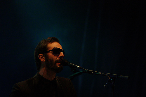
When you take a photo, you often ask yourself a lot of questions about the subject, the foreground, the background, the lines of force that will highlight what you want, especially through perspective, etc… Getting these different parameters to work together to give the meaning and the aesthetics you want to give to your photo is sometimes a difficult exercise. Discover why and how the simplicity and simplicity of an image can enhance its impact.
Have you ever had search a subject for a photo? To have envy to photograph, but not really find a subject that you can inspireseven going so far as to tell you that wherever you are anyway. there is none ? Don’t worry, it’s happened to everyone, and I have good news: this is not true.
Indeed, if you find that your environment is a little empty, or even too full (I am thinking of city dwellers), you just have to play with. This is a constraint, but it can force you to find a different point of view and to innovateand therefore to create. And believe me, in general, it makes beautiful pictures. Indeed, what gives strength to an image is often what is not there, not what is there.
“The real music is between the notes.” Wolfgang Amadeus Mozart
Why does simplicity give strength to images? I won’t go into technical details that I don’t master. Besides, if someone who went to an image school has any explanations, I’m a photographer 😉 That said, in my opinion, by leaving “empty” spaces in a photo, one can accents the subject again. The eye has alternatively than to look at him. It’s actually one more method for bring the spotlight to bearsuch as reduced depth of field, the use of perspective, the rule of thirds, etc…
So how do you play with the simplicity and the minimalism in a photo?
- Choose the right environment : The best way to work on simplicity is to have an environment without too many distracting points, the best example being a uniform background.

(Click on the image to see a larger version on FlickR) - Choose the right topic The rest of the image being empty, you need a good subject. It must break away of the background either by its originality, its impact, or simply naturally by its colour, shape, etc…

(Click on the image to see a larger version on FlickR) - Use reduced depth of field : It is not forbidden to use several techniques to highlight a subject, and a reduced depth of field works. particularly well with a simple environment such as a uniform background. (And if you don’t know how to handle depth of field, I recommend you to start with the article on aperture and go deeper with the course on depth of field 😉 )

(Click to view large on FlickR) - Use colour and/or contrast Contrasting colours between the rest of the image and the subject make it stand out. It goes without saying, but it gets better when you say it. If you prefer black and white, a brightness contrast can also do the trick. Like any “ruler”, you can take it in reverse and photograph a subject with an environment of the same colour, which will give a feeling of simplicity and harmony.
- Do really simple It’s not worth playing on simplicity to leave details. distract the subject’s eye. If you want to work on a simple photo, step out of the frame as many details as possible useless (tree leaves, etc…). This way you will maximize the effect. You can do this by getting closer, zooming in or post-processing.
- Move away/zoom out. : It may seem counterintuitive, but by zooming-out you increase the space around your subject. This way you give less importance to small distracting details that can’t be removed from the picture, and at the same time you leave space for the subject, which makes it even simpler, especially if the environment is uniform.
This is a new way of working with your environment to create beautiful images, but also a way to think photography, some of whom have even made a specialty. So, did you also take pictures that proved to be strong despite their simplicity? Leave a comment if you want to share your experience, facebookez and twittez if you liked the article, and subscribe to the newsletter if you wish to follow the next 😉
And don’t forget to share the article! 🙂


Discussion about this post