Which photo will be selected for review this month? Find out!
(If you don’t know Sunday Photo ReviewI invite you to read the article in which I present the operation).
Before going into the images, some clarifications following questions I received by email, and two news:
- I (re)specify that I strongly encourage you to comment your images with each other. This is very instructive for both the person receiving comments and the person commenting, as it forces you to reflect on the defects and qualities of the image. Don’t be afraid to do so!
- I choose the image for the criticism a little bit at the “coup de coeur”, and there is no extremely high criteria. objective. I try to choose images that can be interesting in their qualities and defects so that it is enriching for everyone. The images already selected in the past or the topics covered on the blog have not of influence over my choice. For example, just because I have already selected a photo in black and white and that I’ve already dealt with this topic on the blog that you don’t stand a chance by posting black and white pictures 😉
- I’ll add as a rule that you must not not have forbidden the downloading of your images (so that I can easily integrate them on the blog)
- Dimanche Critique Photo will now have a theme each month, which will be revealed at the end of the article for the following month. This will start in a month, since there are already many images posted in February 😉 Concretely, during the next Photo Review Sunday of the March 6thI will criticize an image posted in Februaryand give the theme for the images to be posted. during the month of March 😉
Excellent pictures above all
I had a hard time choosing again this month, and I am positively surprised at the quality of certain images. Because I like them very much and I want to highlight them, I’m going to focus your attention on three images of a very different style before going on to critique them:

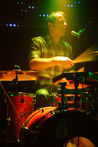
First of all, this picture of concert of Jeremiah Beck. I really like the white balance chosen: just the right amount of heat in the light without the drummer being scarlet. And speaking of light, the spot that illuminates it from above is the most beautiful effect. The drummer’s face is very clear, and Jeremiah still managed to highlight the movement of the rods thanks to a shutter speed that is quite fast slow. That’s when you see that the Master’s degree and the understanding of these technical points really helps to improve your images! If there’s one point that bothers me, it’s the drummer’s hand and forehead that are slightly burnt (overexposed). I don’t know if it was possible to correct this in post-processing, but 😉

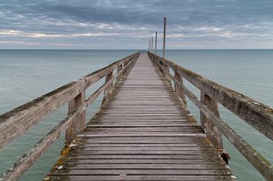
In a completely different style, this image of Luc sur Mer’s jetty by arnaudthx strikes by its composition. The symmetry is almost perfect, and the perspective is very well used to take us into the picture. I began by doubting the choice of white balanceBut in the end, I think the tones are a pretty good reflection of the light atmosphere that must have prevailed at the time.
I also really like “Migration” by Philippe Feyaerts, which I had selected last month for another image. I really like the simplicity of the image and its composition. I probably would have tried a black and white contrast on this picture, but it was your choice Philippe 😉
Let’s go to the chosen image!
Fresh air
This is the title of the picture of jmbourreau, which reads:

The plusses:
- Sharpness at the point of focus The fan appears quite sharp despite the relatively low shutter speed compared to the focal length.
- Good depth of field management : the choice of a depth of field lowthanks to the opening maximum and a great Focal length is wise. It allows to focus attention on a single fan (or almost), which avoids making too much clutter (which could have happened easily given the number of fans).
- The use of perspective It gives you dynamism to the image.
- The colors At first I thought they deserved to be more… saturatedand then I figured the fans were probably in shades pastel that you wanted to preserve, which in this case you did. Not to mention that the slight lack of exposure and contrast I’m talking about afterwards must play a part in this as well.
The least:
- The exhibition The image seems slightly underexposed. It seems to me that the Sony A-200 that you’re using goes up to ISO 3200, so I think you could have used a sensitivity of at least 800 ISO to allow you to increase your exposure a little bit, in short to have a picture more luminous. Indeed, the whites are not white enough for my taste 😉 (but maybe they are not washed with OMO :P)
- The contrast I think it lacks a little pep. I’m sure that a simple use of the levels would have allowed you to give a little more pep to the image.
- The composition Saying it’s a “minus” might be a bit strong, but I would have done differently. First of all, you’ve been focusing on the centre of the image, which is not really a strong point: in general, it is better not to center your subject, unless you want to play on the symmetry (which does not seem to be the case since the image is not symmetrical). I might have focused on a fan in the foregroundand then played even more on the perspective the line formed by the edge of the table/shelf/whatever, perhaps by making it diagonal to it more frank in the picture. And if possible, I would have avoided placing in the frame the fans in the background that are located above, and which slightly hinder the reading of the image.
To sum up, I think we just need to think a little more your image (just by taking a little more timeand/or in trying various frames), and do not hesitate to make minor changes after the fact, if possible in developing the RAW file 😉
So much for this Photo Review Sunday, I hope it was instructive! Post a comment to bounce back on what I said, or to suggest a idea theme for the Sunday Review Photo of the Month of March 😉
And don’t forget to share the article! 🙂


Discussion about this post