This month’s review features intelligent use of shutter speed.
(If you don’t know Sunday Photo ReviewI invite you to read the article in which I present the operation).
This month’s theme was black and white. To my great surprise, very few of you have posted black and white photos! Maybe it wasn’t clear enough? I had however indicated it at the beginning and at the end of the article! Anyway, this month the theme will be about the portrait. So I want to see ONLY portraits this month ! Show yourself original 😉
If you have already posted images this month that do not match the theme, they will not be counted in the quota of 3 images per month obviously. I haven’t yet done an article precisely on this theme (I’m surprised, by the way), but the classical rules of composition apply very well. I still made a video on the digital development of a portrait photo. Think about focusing on the eyes in general 😉 But surprise-Me!
Pictures of the month
As tradition dictates, my favourite images from among those you posted this month:
- A nice light, and a good management of depth of field, composition and message for this picture by Julian Raw. Encouraging! (there’s still a little undefinable “extra thing” missing, but it’s clearly a good picture)
- A really sublime light for this detail photo of Mr. Doo. I would go so far as to say that I don’t mind the very centered composition!
- A very well composed image, intelligently taken, with very good use of color, and intelligent post-processing by Virginie Rooses. Are you inspired by Anne-Laure Jacquart’s work? 😉 (it’s a compliment :D)
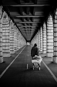
- A millimetre composition, both centred for the setting and off-centre for the subject, with excellent use of the perspectiveA real message, and a very nice high-contrast black-and-white treatment. Definitely one of my favorites of the month: Under the Bridges, by Jeff Vincennes.

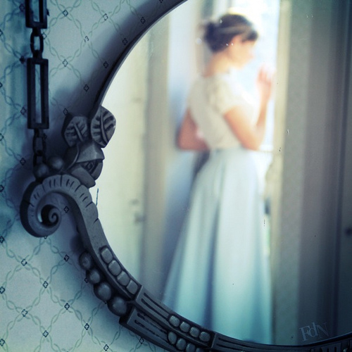
Under the bridge, all rights reserved Jeff Vincennes - And my favorite of the month without a doubt, again all borrowed from poetryand again by FolDeNuit! Nice use of depth of field, nice colors, a very nice title, and I must say that subjectively, I love to use the mirrors 😀

To the news I bring, all rights reserved FolDeNuit
This month’s review
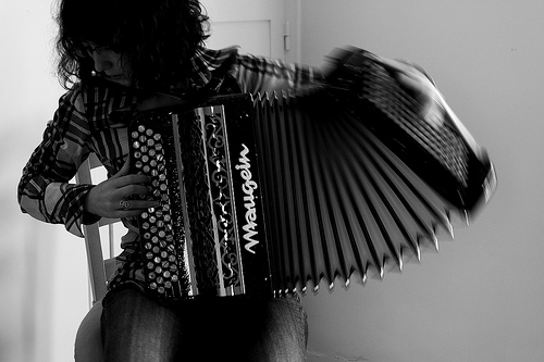
This month for this black and white theme, I chose the photo “Breathe” by Etienne Hydray :

The plusses:
- What is most obvious is good shutter speed management. Etienne shot at 1/15th of a second at 50mm f/1.8, and used a tripod to stabilize the camera. Thanks to this method, the accordionist is netbut his arm and the moving part of the accordion are fuzzywhich gives a strong dynamism to the image. It is therefore clear that a good understanding of the exposure parameters allows one to play with their effects, here to highlight the movement.
- A composition overall good. The first point of interest that jumps out is the left hand of the accordionist, highlighted by the motion blur and the fact that it’s relatively well lit. A second, less obvious point of interest is its face…half hidden and a little mysterious. She’s almost anonymous but at the same time couldn’t be just anyone, and moreover the posture gives the impression that she’s really immersed in her music, which conveys a certain emotion.
The least:
- I would have briefing more the image. I rather like dark images, but the background being quite bright anyway, I would have lightened the image a bit. When I took the picture, it was easy toopen a little more I think (f/5.6 see f/4), or if we wanted to keep the depth of field from going up to ISO 400 (sensitivity at which noise is almost invisible). In post-processing, it was quite possible to increase the brightness comfortably, because at ISO 200 the noise created would have been quite manageable. We also note that it would have allowed us to recover a bit of detail in the hair. Not that they’re a major component of the image, but it would probably have added some depth and the dynamismwithout distracting the eye since they are still dark.
- I would also have contrasting a little more image, to give it a little more vitality. Using the contrast slider would probably clears the face for example, which would have made him more prominent. Also, it would have added white to the image, which lacks really clear areas (e.g. the accordion mark). Moreover, perhaps the contrast could have been a substitute for increasing the brightness.
- Small point of detail: the hinge of the door in the background is visually annoying (as far as I’m concerned, my eye stopped on it), and I think it should have been theremove. How? Well, by opening the diaphragm wider, we could have lost him in a… fuzzy depth of field, or by moving relative to the subject. It may not have been as simple to capture the right postureEspecially since we’re less mobile working at tripod.
Here you go, feel free to leave your comments on this image (or others), and don’t forget to post your images on the Flickr group on the theme of the portrait. See you on Sunday 1st May for the lily of the valley and for the April Photo Review Sunday, and until then look at the photos of the others and comment themI’m sure you’ll also get feedback on your pictures thanks to this! 😉
And don’t forget to share the article! 🙂


Discussion about this post