And yes, it’s Tuesday, but today is Photo Review Sunday, which was last month on the theme of air.
(If you don’t know Dimanche Critique Photo, I invite you to read the article in which I present the operation).
As you probably know, I finally got my guide to the choice of photo lens Last Sunday, that’s why I didn’t have much time to write the now traditional monthly Photo Review Sunday. So it’s done with last month’s theme which was : the air. What’s funny about the photos you’re proposing this month is that we can see that the way you’re taking up the theme is very much related to the environment: a lot of photos of foggy landscapes for example. It would be interesting to see what the same theme would look like in the middle of summer.
In short, the theme for this December will be… the the late ! Yes, I decided to continue on the 4 elements 😉 That said, you have the right to take the fire at the broad definitionincluding everything that replaces it artificially (like light bulbs, which I say perfectly randomly in these festive times of coloured garlands :P). But still be original: if you decide to go around the holiday theme (which some people have already started to do), try to get off the beaten track a bit, take different points of view, in short, get creative ! (as always)
Pictures of the month
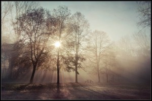
First of all, the image that immediately blew me away with its aestheticsit’s just a picture of a foggy landscape. Extremely successful, thanks to the shooting but also it seems to me to be a accurate post-processing which gives these slightly pastel colours that wonderfully reinforce this feeling of tranquility, while remaining natural.
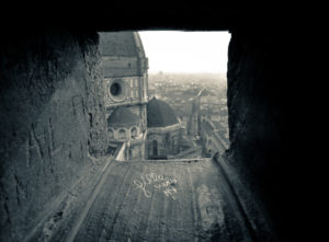
Then it’s a very pretty picture of Florence that evokes many things that touched me. A airy feeling indeed, with a composition excellent, a nice set of lights, a very good management of the depth of field, and a treatment that has the merit of being sliced (I do not know if it was the best, but the rendering is interesting).
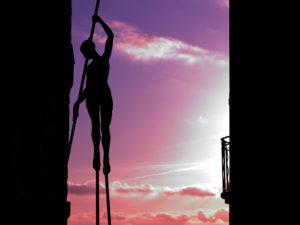
I really like it when you divert the theme advantageously, and with “the girl in the air”, we have here an excellent realization: a very good mastery of the shadow effect, which allows a bold composition. Note that the frame is horizontal, but the “frame within the frame” formed by the sky is almost 3/2 format, which gives the impression that a photo taken vertically has been included in it. Moreover the silhouette stands out very well, and the presence of the sky reinforces the theme while keeping the emphasis on the subject so particular.
And finally, even if it’s out of the theme, I also really liked this portrait of a chess player. For once in my life, let’s play a little: tell me in the comments what you think is the strength of this picture! Let’s see if you’ve learned your lesson ;P
The Criticism
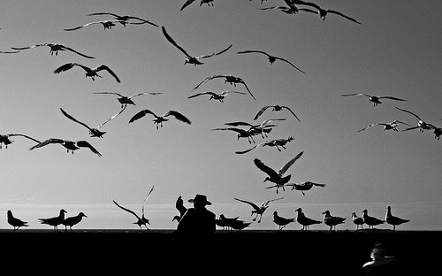
The most :
- The general ideaThis is in keeping with the theme but has clearly been the subject of some reflection.
- The contrast The black and white is well done, the blacks are well black and the whites are well white. It was hard to do better with a sky that must have been all blue I guess, but anyway it’s not bad, because it brings some simplicity to the image. I think clouds would have interfered with the reading.
- The composition in general a man in a hat, centered, and gulls accompanying him, some of which are flying. The edge of the dike runs parallel to the horizon, while leaving plenty of room for the sky. All good ideas, but a little spoiled by the main flaw in the image.
The least :
The inaccuracies of the composition: And yes, because even if the general idea is good, it gives me a bit of a feeling ofunfinished. For several reasons:
- Man is not perfectly centered. As I have often said, as far as the rules of composition are concerned, we must either respect them almost to the letter or take them completely at face value, but in any case make a strong choice.
- L’bird down right disrupts this black mass of the dike that gives strength and simplicity to the image.
- Gulls are coupé It was probably not easy to do better immediately, but sometimes you have to wait several minutes for thedecisive momentas I explained in my making-of of a street picture.
- There may be too of gulls. Ideally, I would have thought it great if there was only one flying in the picture. Maybe with the man off-center on the left and the gull on the right, or the other way around. Of course, this is a hypothetical situation, and maybe it was difficult in real life. In any case, I have the feeling that the image would have benefited from being a little less charged on that side.
Here, I chose this picture to show you that an idea of composition can be good, but you have to be rigorous in its application and take one’s time to perfect it and make it exactly what we have in mind. Even if we have to wait 5 or 10 minutes for the right moment to come.
I’ll see you in 2012, for a photo on the theme of the the late 😉
And don’t forget to share the article! 🙂



Discussion about this post