The theme I suggested in July for Operation Photo Critics Sunday was ” Reflections ” : let’s see together the best pictures of the month and the one selected for the review.
(If you don’t know Dimanche Critique Photo, I invite you to read the article in which I present the operation).
First of all sorry for the delay of this Critical Sunday, these last few days my time has been very limited due to the Lille sell-off, the end of my studies (just :P), the parties that followed and a few other things that kept my mind busy. But don’t worry, it’s back to a normal rhythm!
After this more personal note, let’s get to the heart of the matter. For this DCP on the theme of reflectionsIf you’re a photographer, you’ve thought about a lot of classic surfaces like windows, sunglasses or… puddles (not difficult with the summer we’ve had ! :D) There were a lot of entries this month, but a lot of off-topic photos (you read the themes ? :P), so the selection was a little less hard.
The theme for September will therefore be movement. You will be able to play with shutter speed! 😉
Pictures of the month
To begin with, two very successful silver photos, with this particular charm but also with an interesting composition and atmosphere, both using reflection in a puddle, in Paris. A very vintage looking scooter, and a 2nd interesting picture, especially thanks to the pigeon passing in the reflection! 😉 (Unfortunately I can’t post them on the blog, because François has disabled the downloading of his pictures…)
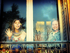
An image full of tenderness by Philippine Chauvin, whose reflections add enormously to the particular atmosphere that emerges from it (with the tiny defect of not being quite straight, but good seen as the image made me smile, I pass 😉 )

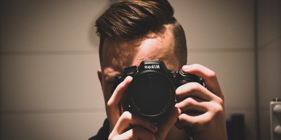
In the same style, the reflections of this portrait add enormously to the atmosphere, but also to the story it tells. And last but not least, a good idea, even if I’m sure that post-processing could have improved the image a bit (a nice black and white maybe? 😉 ).
This month’s review
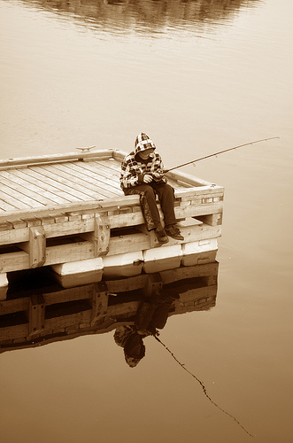
This month I chose an image of Sophie Mineault, who chose to use water to reflect her subject.

Overall, the image starts from a good idea, the exposure is well managed, the reflection is successful, and the subject is interesting enough. I don’t elaborate more than that on the positive points because they are relatively obvious and there’s not much to say about them. However, I have some (constructive) criticisms about the composition in particular.
Indeed, I think she could have been more neat. For starters, the dark reflection on top interferes with the reading of the image in my opinion. It’s relatively easy to eliminate, but the rest of the composition bothers me a bit too. With the reflection, you can easily try to achieve symmetry, and that’s what Sophie seems to have done in in focus vertically and horizontally. But when you play on symmetry, it has to be absoluteon at least one of the two axes (vertical or horizontal). Let me explain.
On theupright axisThe subject is not symmetrical: the boy is not looked at from the front, his fishing rod is directed to one side, and the pontoon is only present on the left side of the picture. The subject is thus by nature unbalancedso it needs to be off-centre to rebalance it. That’s the whole point of off-centring the subject, and Michael Freeman addresses this notion of balance of forces in his book The Photographer’s Mind. (Maybe I should write about it, what do you think? 😉 )
On thehorizontal axlethe subject is not symmetrical either since the pontoon is “tilted” in the picture, and so it would have been necessary to take a different stance or off-center. (In addition, the dark reflection of the high unbalance even more.)
So in this situation, there were two main models of composition that worked for me:
- Totally center the subject, by placing oneself full face up, and making the pontoon make a perfectly horizontal line that crosses the image in the middle.
- Simply use the reflection as an additional interest by frankly shifting the focus away from the subject. Someone suggested a landscape format in comments, which I think is indeed a good option.
I think that’s the main criticism that can be made of the image, but it’s true that composition in this situation is quite difficult to manage. The 2nd flaw is partly more personal, but I don’t like the treatment. I don’t like the sepia in general, but I have the impression of a lack of contrastand the simple application of a preset effect (sorry if I’m wrong, but that’s how I feel when I look at the picture). I would have preferred a nice, high-contrast black and white, which in my opinion would have enhanced the image better.
Here you are, so feel free to bring us your own reviews by commentit’s always interesting to compare notes. And I’m waiting for your images on the theme of movement ! 😉
And don’t forget to share the article! 🙂


Discussion about this post