Here is finally the very first ” Photo Review Sunday ” of a long series, for which I reserve you a small surprise to discover just below…
I thought I would choose only one image from all the ones you proposed, but I finally made the decision to take one both. Why these and no others, and why two?
Well first of all, I want you to know that if I didn’t choose yours, it’s not because it’s too bad or too good: there were things to say about each picture, but I had to make a choice.
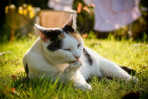
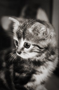
So mine was in two photos of catsThe first is Matheew Lauren’s, and the second is Quenton’s, which you will (re)discover below. Indeed, the domestic animals are one of the first subjects that the photographer addresses. In fact, to tell you the truth, my earliest photo with my reflex was that of a cat! 😀 And it was ugly. And yes, who says subject current and affordable, said easy to make a picture banal. So the pet picture is, in my opinion, a little… trapper…because it’s hard to make your cliché stand out from the crowd.
Having two such images in your proposals also gives me the opportunity to make a kind of “comparative criticism”, especially since they are both rather maids (in my opinion), but with a few defects.
Anyway, let’s get to the point!
Photo n°1: Athena

The plusses:
- Your subject is good. net The focus is correctly adjusted and the depth of field is sufficient to ensure that the front of the body is in focus.
- Speaking of depth of field, it is also sufficiently low to clearly blur the background. It might be surprising at 6.3, but as we’ve seen, the depth of field is not only influenced by the aperture. We can see that you chose it as it is since you were in aperture priority mode 😉 (EXIFs say a lot :P)
- The light is really very pretty. It’s shaving, coming slightly from behind but not against the light, in short it’s well managed.
- Have you thought about you lower and to put you at the animal level. Congratulations, many forget it!
- There’s a foregroundwith the few blades of grass that are blurry in front. It gives you depth to the cliche, that’s pretty good.
The least:
- Your subject matter is a little too much centered. Not dramatically, but I would still have liked to see it a little off-center, especially vertically.
- The main flaw, in my opinion, is that there’s too mucheye-disturbing elements. That dark spot at the bottom right (a dead leaf?), the sheets (?) hanging at the bottom, etc… I would have loved your subject to be more isolated from the background. So obviously, it’s not obvious, I’m well aware of that.
How do we do that? Increasing the opening to blur the background even more, try to move to have a more homogeneous and/or more distant background, bond or zoom in to further decrease the depth of field. - Speaking of getting closer or zooming in, I think it would have taken a little more fill in the gaps with your subject, in other words, leave less space around it. But don’t cut it off, be careful! 😉
In the end, it is therefore a lot of small details that make the qualities or defects of an image 😉.
Photo n°2 : My Cat

The first thing that surprised me was that a picture taken with the camera’s flash would look so good! But I know that you had a bit of trouble to get a properly exposed picture because the light was missing a lot.
The plusses:
- The conversion to black and white which is very well done.
- The little grain that gives the image a certain charm.
- The subject fits the bill. A little too tight on the right, but as it’s blurred by the reduced depth of field, it’s fine 😉
- There’s almost no distractions in the background.
- L’expression is pretty (well it’s a kitten, it’s difficult to do otherwise :D)
- You did leave some “room” for your kitten’s eyes by leaving more space in front of him than behind. That balance a lot of the image I think, because strangely enough the eye is almost centered and yet the composition works. Like the rule of thirds… 😉
The least:
- I have a feeling that the eye is not exactly net. Maybe because of the small image size, or high ISO, or more likely because of the low shutter speed. What bothers me is that it doesn’t look like a motion blur, so I wonder if it’s the clarification which would be a little rough.
- I don’t know if it was possible with the optics you were using, but I would have loved for you to have used an greater openness to be able to have a shutter speed that freeze your subject well, and maybe lower the ISO a little bit.
Conclusion
Now, the reason I was talking about comparative commentary above is because we could almost reverse the pluses and minuses of each image. I think these two images reveal two things:
- You’re starting to master a lot of the advice I give on the blog.
- You’re still having a little trouble thinking about simultaneously.
But don’t worry, person thinks of everything every time, besides it would be impossible or even counterproductive. But certain principles will come into play with the practice and theexercise your eye a photographer. Keep taking pictures as long as you feel like it, because you’re on the right track these are no longer clichés of great beginners, you can feel that you have a certain reflection photographic!
That’s it, you can now start posting your images for the month of December, for the first Photo Review Sunday of the year. 2011 ! In the meantime, I encourage everyone to comment other people’s photos, because all opinions are important. And if you have any questions, comments, that you disagree with my criticism, post a comment below 😉
And don’t forget to share the article! 🙂


Discussion about this post