This month, Dimanche Critique Photo had as its theme the portrait. So let’s see which faces made an impression on me and which one will be the subject of a detailed review.
(If you don’t know Dimanche Critique Photo, I invite you to read the article in which I present the operation).
To start, I must confess that if I post this Photo Review Sunday… on a Tuesday, it’s because I had forgotten it 😛 To tell you the truth, I was already working on another article for this week 😉
By the way, speaking of monthly appointments, the 15th of the month is approaching, and I only received 2 RAW files for the “Give me your RAW” operation. You have 15 days left to choose one of your files and send it to me!
In short, the theme of this month’s Sunday Photo Review was about the portrait. The theme was better respected than last month, but there are still a few images that were not 😉. This month’s theme is more vague: “Detail». So I leave it to your imagination to compose images that will go well with this theme.
Intuitively one can think of macro first of all, especially since this month has been partly about this theme with the 3 current problems in macro and the test of 2 macro objectives. So it’s the technique that comes immediately to mind, but you’re only not required to use it, of course. For example, you can emphasize details of something we’re used to seeing in the big picture, or minutiae by isolating it in a much larger and uniform whole (a white pebble among red pebbles is a detail 😉 ). Using simplicity and purifying your images can be very useful! In short, I leave the beautiful part to your imagination in this month of May that should make you inspire and make you want to take the plane out, considering the weather 😀 (finally in the North :P)
Pictures of the month
As usual, there were a lot of very nice pictures this month, and I’m glad to see your images improve! I modestly hope to have my share 🙂 I was amused to see that most of the portraits were of women, babies or people from far away countries 😛 It is true that these are perhaps “more photogenic” subjects than others, and I tend to do portraits of women myself preferably.
- “ThisIsLouloute” has posted three portraits this month, and I especially like this one:
 A perfect focus, a very nice light, a pretty model, and the magic of 50mm f/1.8 😉 We also note a 2nd portrait that works very well, and where the bias is to focus on the hair, as if going off the beaten track can give a lot of strength to an image.
 -
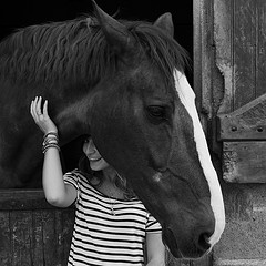
“juldetroy” gives us a nice black and white portrait, full of contrasts, full of complicity, and with an excellent idea of composition by framing his subject with the horse. This composition forces the gaze to go towards the eye, while giving a secondary center of interest (the horse) that balance the image.

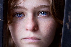
(Click on the image to see a larger version on Flickr) - Finally, Matheew Lauren offers us a portrait full ofemotion and very well showcased by the light and the treatmentIn this case, he also frames his subject with an element of the scenery, and the choice of very tight framing gives a lot of strength to the image, reinforcing the closeness to his subject. Very tight choices francsI like it a lot !

This month’s review
This month, I chose a portrait that I thought was fairly representative of what you might encounter as a situation: a spontaneous portrait of a child. The IxPo photo seemed interesting to criticize:

The most :
- 50mm, f/2.8… Smells like a… wide aperture fixed focal length ! I can’t say it enough, it’s an excellent lens for portraiture. It’s really a positive point, not a way to insist heavily on this excellent lens 😛 Choosing the right lens is part of the photographic process.
- A good adjustment. At this opening, you have to pay attention to its development, and there it is well done.
- A pretty expression Capturing the right moment is not always easy, but it is the essence of the photographic process. Here we feel all the natural and the spontaneity of the photo (although very young children are seldom posed :P)
- A reduced depth of field to diminish the impact of the background, which here is rather unattractive and disturbing because it is not uniform.
The least :
- In spite of this depth of field, the background remains annoying for me, especially because of his inconsistency. It would have been all white or all brown, it wouldn’t have been a problem, but now it’s a bit difficult to read the image. What’s the solution? Maybe an even shallower depth of field, but that wouldn’t have entirely solved the problem. In this case I would have revolved around me to find a better background.
I am well aware that it is not always obvious in spontaneous photos, but you have to think about provide that kind of detail before and then calmly trigger 😉. - Even more disturbing is the fuschia pink candle in the foreground. As I mentioned in the article on what catches the eye in photography, the bright colors tend to look away. Even blurred, this candle competes with the main subject, which moreover does not have very bright colours (even pink is rather pastel). At the same time I would worry if the baby was fluorescent orange 😛
The solution? Place the candle out of scope (moving, getting closer, …), or reframe a posteriori (square format?), or try the black and white. - A lack of aftertreatment I feel like it’s a jpeg out of the camera, am I wrong? In any case, the photo would have been much better with a white balance a little warmer (or at least less neutral), a little more contrastand a little more saturation in colors. A matter of minutes with RawTherapee 😉
Well, once again I think it’s clear that the difference is in the small detailsbut who have all their importance ! Feel free to leave your comments on this image (or others), and don’t forget to post your images on the Flickr group on the theme of the detail. See you next month for the Photo Review Sunday in May, and remember to comment on other people’s photos! 😉
And don’t forget to share the article! 🙂


Discussion about this post