On all the photo sites and blogs that you can see (including here), they tell you about rules. The rule of thirds of course, but also how to get “good” exposure. Let’s see why we shouldn’t make a big deal out of it.
(Disclaimer: this article is written with passion. You are warned 😉 )
This article was inspired by the comments on the photos selected for the travel photo contest. Indeed, there were some negative opinions on the photos, which is not serious as long as it’s constructive 😉 The only problem is the perfect picture doesn’t exist. That could have been the title of this article, and I had already written a year ago that the perfect exhibition doesn’t exist 😉.
It seemed to me, however, that in all my articles, I specify that the rules can be bypassed and they’re not there to be respected. absolutely and constantly. They are above all guides to train your eye to think about composition.
For example, I regularly find that I naturally frame some photos according to the golden ratio, while I completely center the subject on others. Why do I do this? Because I meaning just like that.
You’re going to tell me that “feeling it” is absolutely abstract, and it is! 😀 Let’s go into more explanations. concrete.
The perfect exposure does not (always) exist
I feel compelled to repeat the title of this old article, as it seems that after learning about the technique to properly expose one’s image, one forgets that overexposure and underexposure are all relativeand that the way in which the image is exposed is also a way of expressing its creativity (let’s remember that that’s what we’re here for first, and that technical perfection without emotion or creativity, it has absolutely no no interest).
Indeed, it is not always useful to maintain detail in all areas of the image. It all depends on the subject. And theemotion. The one you feel, and you want to put into the picture.
If you take the photo #1 selected for the contest, 80% of the image is totally black (underexposed), and the little piece of sky in the background is overexposed. Why is this?
First, because technically, he was near impossible to do otherwise. The tunnel was very dark and the sky brightly lit If the tunnel had been “well” exposed (if we had seen the details), we would not have seen the subject, which would have been largely over-exposed. Conversely, if the sky had been correctly exposed, the subject would have been underexposed.
But now.., the subject is well exposed You can clearly distinguish him and you can see the colours and the cloud of dust around him. And the rest, FUCK! What’s the point of having details about the tunnel walls? That’s not the point, so it doesn’t matter. Especially since the very dark tunnel simplifies the picture, frame the subject and guides the eye to him.
I take this example, but it is valid for a lot of pictures. For example, I recently took pictures at an outdoor festival. The backdrop was dark, but because of the daylight, you could still see the folds of the tarpaulins in the pictures. So I pushed the black during RAW development for darken the bottom. Result in terms of exposure: a large part of the image is “underexposed”, since it is black or almost black. Result in terms of image strength: the image is strengthened, since the subject is more isolated of his background, and more contrasting. In this case, it is therefore a good thing to (globally) underexpose the image! 🙂
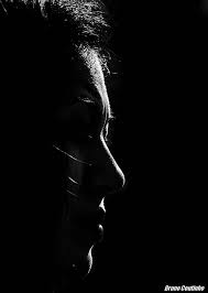
Another well known example is the photos in “high key” or in “low key.”. These two techniques (often used in the studio because the light is better controlled there) consist of deliberately overexposing or underexposing the majority of the image in order to bring out the subject in a very particular way. It is very often used in portraiture, and can give extremely interesting results from an aesthetic and artistic point of view.
 Perfil com luz by coutinhobr
So tryTo see the effect, try to underexpose or overexpose your images. Above all, don’t get caught in the straitjacket of “perfect exposure”! Be careful, I’m not saying that you shouldn’t learn exposure: it’s VERY important to control it. But once you’ve understood the basics, play with. If you stay too much on the beaten track, your photos will remain bland and tasteless.
A very simple trick you can implement right now: switch to manual mode, and try to guess the settings you need to get the exposure you want on a picture. Since there’s an 80% chance that you’re going to screw up royally (and that’s normal, it takes a long time to guess the light at this point), you’re going to underexpose or overexpose your pictures. Don’t throw them away, but analyze them. Try to see what you like, what this change in exposure produces as an effect and as an emotion.
Because photography is emotion before technique. The technique itself is boring. Its mastery must remain a tool at the service of your creativity, and not the other way around! 😉
The Third Party Rule and Company
A second thing that came out in the comments of these pictures, but which also comes out very much in general in the criticisms on the forums, is the respect of the rule of third parties.
Don’t let it be said that I’m contradicting myself: I teach it here, and I use it myself a lot.. It is to my mind indispensable to know it and to master it.
That said, that doesn’t mean that a picture that doesn’t respect it is a bad reputation. It would be far too simple if you just had to place your subject on a third party intersection to get a good picture: any computer would be able to take a good picture!
The other compositions work too. And yes, even in centering the whole point! Centering the subject does not work in all situations (nor does the rule of thirds), and it would be illusory to list all the typical situations where one can center one’s subject. But there are still a few factors that make this type of composition a little easier:
- A very simple image…with no distracting elements. You will notice that this is the case for the first 2 images of the contest, and that the rather centered composition works well.
- A subject “framed” by an element of the decor This is the case in the first one, where it is framed by the tunnel exit. You can think of someone sticking his head out of a window, etc…
- By extension, a photo where symmetrical elements guide the gaze towards the subject. Take for example someone at the bottom of a staircase: the two handrails can guide the gaze towards the subject, and a centred composition will probably be better than one that follows the rule of thirds.
These are only examples, but I want to stress again the need toexperiment. Once you have fully understood and integrated the rule of thirds, try to focus your topic.
I’m well aware that this article may make it seem like I want you jiggle the chips good news, it is! 😀 But I want to point out that I understand you Absolutely: by dint of reading about the photo technique and trying to improve, your head is a little bit in the handlebars, and you think more than you feel. I know that’s true, I’ve been there, too. (and it’s still happening to me) 🙂
What I’m trying to tell you is to raise your head a little, to breathe, and for one day to forget to think about technique and to shoot with your gutjust like I wrote this article with mine. Maybe some pictures will be technically missed (and then you’ll have to keep working on it to improve yourself). But maybe you’ll be more creative…and you’ll walk away with a cliché that conveys emotion.
Don’t wait, don’t do it tomorrow, do it. these days (and share your reactions and images in the comments 😉 ).
And don’t forget to share the article! 🙂


Discussion about this post