I’ve said it before, but to be interested in the image in general and in others graphic arts in particular can give you a real plus in photography. That’s why I decided to welcome another guest blogger who is more of a drawer than a photographer, and who brings us his very interesting and well illustrated vision on the contribution of drawing to the composition. Composition which is as essential (if not more so) in photography as in drawing. So I let him speak.
My name is Roy Pallas, I am the author of the blog “le dessin”, in which I share my experience and motivational tips. Given that photography has drawn on previous arts to create its codes, it seems obvious that learning (a little) about painting and drawing can only be of benefit to lovers of instant images. For this intervention on Laurent’s blog, I decided to share with you some principles of compositions used in drawing.
Nature, this artist…
Nature has an infinite wealth of contours and spaces. The shapes that can be observed in nature are the basis for the illustrative and creative approach of Andrew Loomis. The latter is a famous illustrator who has written very educational books on learning to draw, some excerpts of which you will see in this article.
(Note by Laurent: work that has fallen into the public domain 😉 )
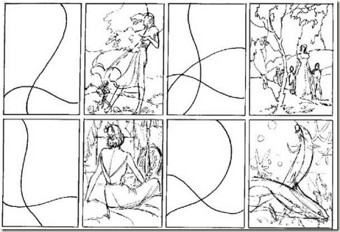
If you look at a landscape, you will see that the shapes cross, follow each other, overlap… Framing this space (with a camera for example) reveals this line harmony that make up the environment.
A simple exercise to learn how to spot these curves is to do the following trace on your images. In this way you will sharpen your eye and have a more precise sense of observation.
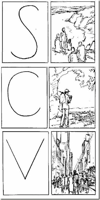
You can also search the landscape for elements that look like alphabetic letters or other symbols to make your compositions more organized.
The search for balance
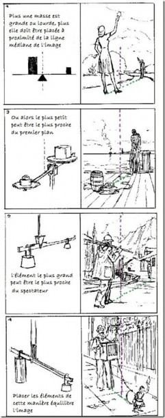
For an image to be pleasing to the eye it needsbalance. The concern is to obtain this harmony without having recourse to rigid and purely geometrical axes of symmetry. So how do you get an image that looks balanced with curves for example? I have to tell you that balance is really a matter of relative judgment. It’s up to us to decide whether to move a shape, whether to place it in a less constrained, more airy space, or whether it should overlap with another element in the image… Nevertheless there are certain rules which are applied in a drawing that can be used to make harmonious clichés.
One that is important is to not to have two identical elements on the same level (prefer an odd number) that overlap or are juxtaposed. If you have two identical elements, try in most cases to arrange them in each corner of the picture.
Between two shapes of different height and width, care is taken to leave the space between the two by airing the centre of the image. The middle line of the image is like the fulcrum of a balance and each form must be arranged on either side of it.
But be careful not to fall into that trap…
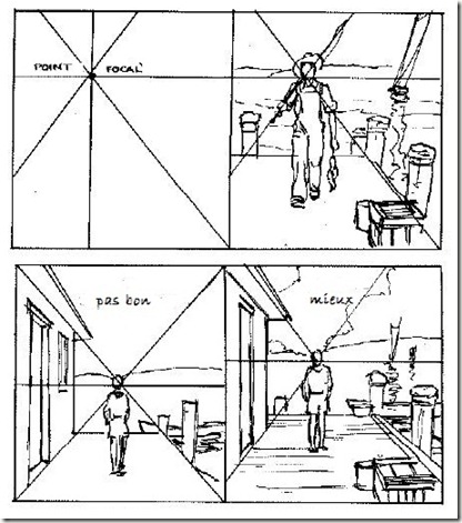
If you’re using geometric perspective, you can set a character to “the place of honour“, i.e. the point of convergence of the leaking lines. In doing so, it’s as if the whole landscape converges towards him. So he’ll get all the attention. But on the other hand, be careful not to make the mistake of placing the vanishing point and the character in the middle of your image. As explained by your regular editor Laurent (note: in the article on the rule of thirds for example)A symmetrical photograph is boring, so is a drawing. Prefer to use one of the arrangements below instead.
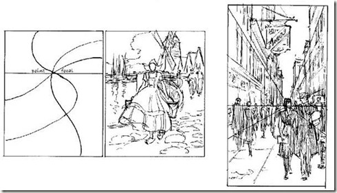
How the gaze circulates in an image
That’s what photography, painting and drawing are all about. As much to say that the way the eye moves through an image is important. And for good reason! The path that the viewer’s gaze will take will determine for many how they will appropriate your image and understand (or not) what you want to put through it.
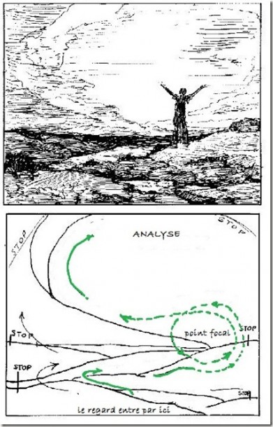
In a good composition, the eye must be able to make a precise path between the elements of the image. In this one for example, the character is outside, on a platform without relief, so the image is very airy and the construction lines are very visible. However, you can also make this image less monotonous by adding ” ” to it. visual impediments “, off-screen areas.
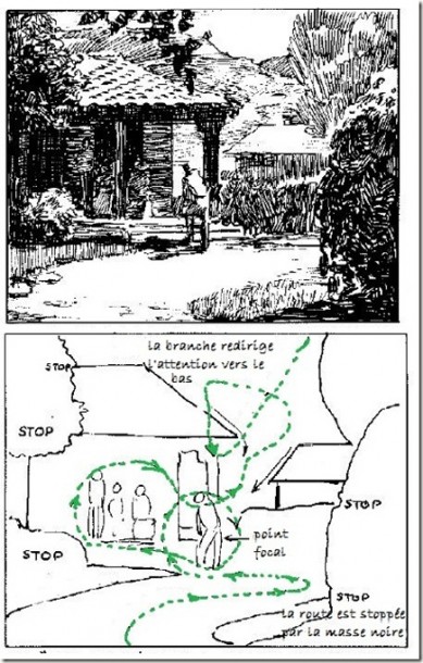
In general, the look enters an image through the foreground (so from below) and backspring. But here, the bushes are obstacles to the view. The eye follows the path to the character and the moment he is about to leave the picture. Hop! A branch with leaves makes him turn around to go back once more to the house area before exiting from above.
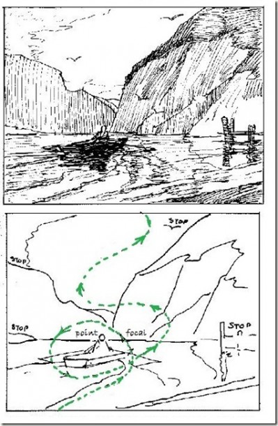
In this last example, the eye always enters from below. It arrives on the boat. It makes a detour to the small pontoon or stops on the mountains. It continues its ascent, does some bird watching and then leaves the picture. You notice that the main subject (the character and his boat) is the centre of attention for a little while. This attention is then transferred to the landscape relief in the background. At the same time as these push the gaze out through the open space, they follow the first subject of the photograph (the small boat). The important areas of the image follow one another thanks to the sequence of the different shots.
Exceptions otherwise it would be boring!
The rule of looking out from above is not always true. There are exceptions and here is one in painting.
Vermeer’s lace-maker.
Why Vermeer? Experts agree that that he used a darkroom to paint his subjects…. He is therefore an artist who has a direct relationship with the photographic process to compose his paintings. He is also a painter that I particularly like. He did not produce many paintings during his lifetime and his life is like his paintings: enigmatic.
Vermeer painted some views of Delft but the majority of his subjects are interior scenes. An enclosed environment, with very few elements skillfully placed to direct the viewer’s gaze. And this, while giving an impression of concentration that emanates from this woman in the middle of her work. Demonstration.
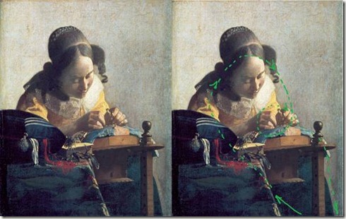
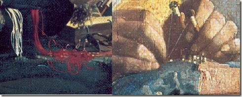
The eye enters through the foreground of the table (by the way you can notice the imaccuracy of the gesture used to return the filaments of the cushion), it goes up along the arm of the young woman, goes through the corner of her face to finally reach the hands holding the thread. As a possible way out, Vermeer used the end of the work table and brought it down to the bottom of the painting. Note the accuracy with which the wire was painted unlike the environment.
Here, I took a tour of the key notions and the simplest to remember when composing an image. I won’t hide from you that there is still a lot to be said about the relationship between photography and pictorial/graphic arts.
Proust said something that I like very much, “The only real journey is not to go to other landscapes, but to have other eyes….” So I hope you enjoyed the journey I’ve proposed through my favourite fields and that it brings you a new perspective for your future pictures.



Discussion about this post